Monday, November 26, 2007

second objective? Emotional objective

I was reading Emotional Design by Don Normal and was quite moved by some of the "user experiences" he has shared about objects which some feel pride in using. This makes me think about UIs; emotional appeal is indeed important for making a product "long lasting". Should "emotional appeal" be considered "strongly" like we consider "tasks"? I guess yes.

During designing I take up an objective which helps me be on track. My small trick is to frame an objective in a single sentence. My observation is if you are clear about your product/problem you will be able to frame it in a single sentence.


So all my projects have a "objective". All of these were related to Tasks or logic related. say like, "building a product which help users FIND and SHARE <certain> information." This makes design decisions easy for interaction designers. But what about - Visuals or content? I guess here is where the emotional design will fill in.
Build an emotional objective - say like "to make the user smile every time he visits (or interact etc) this product". This is very good way to think about visuals and content (including error messages). This could keep an emotional punch in your product.
So while interaction, information, usability can keep the product simple and usable; this can keep the product "engaging and fun to use". Have 2 objective one task related one emotions related. What do you say?

Blogged with Flock

Tuesday, November 13, 2007

Changing times

Well I wanted to write this; but somehow wasn’t getting enough time and motivation.

Changing times – good times or the bad times? Don’t know; what I know for sure – its definitely interesting.

I’m seeing a trend in internet companies and the internet in general. There is a significant shift from the traditional models of internet companies. It becoming more “open” .

The single point focus on consumers is broadening to include Advertisers, publishers and developers. Look at latest acquisitions from all these big companies MSN, Google and Yahoo!. All companies are trying to broaden theie focus to include a good portfolio of products/connections to Advertisers and Publishers. What should we expect? Well I wouldn’t be too surprised if these “advertiser / publisher tools” become a focus of design and get more attention (like consumer facing product) – become better designed products.

Also I guess the companies are realizing the power of “open system” – the spider model. Innovation can not be done from closed doors; it can come from anywhere. So what we do? Don’t push innovative product but push TOOLS. Let people build on it. I really like this idea of open innovation. Two recent news Google Mobile OS & Awards for facebook developers point to this changed mindset. It’s difficult to innovate continuously with a closed system; the competition from individual could be enormous. Thus its intelligent to join the league than fight it.

These are interesting times. We need to wait and see how all of this shapes up the next big thin. This could be a start of Web 3.0; who knows?

Monday, October 22, 2007

Design in exceptions

Thinking of the project/products I have worked on I realize that the real design was not in designing for normal cases but in “exceptions”. Imagine yourself designing a Search Page.

User types in a query = result found. Query Page + Search Results page. Job well done!!!

Simple isn’t it?

But look at the broader picture – lets say there are cases where the query is not exactly found. What do we do then? How will the system behave?

Should it show the results along with the message? Or should we not show irrelevant results and ask few more questions from the user? And also when should we do that – if the relevance is 75 or 50 or 25?

These are the complication of design. How do you deal with these numerous cases in your produce really defines how comprehensively have you thought about it. Normal cases are easier to handle they don’t take so much time and your mental resources.

Thus design is in exceptional cases. You will design with an approach – every thing will go well but suddenly there will be one case where this approach will crumble. How smartly you deal with it really defines how well the product get designed.

Wednesday, October 10, 2007

Is it worth?

I was in Sunnyvale few weeks back and I was having a discussion with Prasad over the lunch. Prasad mentioned something interesting about discussing design.

Most often we land up discussing with PMs or Engineers or other designers and the discussions land up in conflicts say about changing the link color from blue to black. Now it’s difficult to argue especially with PMs who have data to back up their claims most of the time. So as designer you loose the argument unless you have the data or a design research to back your point.

Prasad mentioned something interesting. He said when you discuss these issues also look for a new parameter “If I change this how much impact is this going to create to the users”; “Is it impacting a substantial amount of our user base or just 50 of them?”; “If its just 50 user that this change is going to impact, then is it worth doing it?”

It’s a very crucial point if you look at it deeply. Not only this ‘parameter’ can be used in design discussion but I guess also effectively during ‘designing’. It is worthwhile to look at our design and ask – is this change going to impact a large user base? Should I focus on this problem or shift to other problem which can have a greater impact?

Nice and important point.

Sunday, September 16, 2007

Sprinting: the Scrum experience

Scrum is an Agile PD process, which is seemingly becoming very popular in the industry. So I thought of writing about it a bit. I was fortunate to work on two projects – one was using scrum the other was not. So I could see the difference between the two. Let me share some of my experiences with you.

The worst problem with scrum is - you land up working hard all through the product lifecycle :(


Implementational approach

My feeling has been that Scrum has a very ‘implementational’ character. Implementational? A very focused approach to ‘implementation’ than design, exploration or research. It’s very effective if you know what you are implementing. Thus this basic implementation approach most of the times conflicts with design. Which by character is more exploratory and research oriented. Design due to its subjective character involves a lot of analysis and discussions (with shareholders, PMs etc).


Design: subjective (& dynamic in internet business)
Another issue with design is that it has dependences on business; any changes in business and strategy could substantially influence the approach to design and design solution. Thus it becomes critical how and when you use Scrum for design. Suddenly a competitor comes in the market and you have to rethink strategies and design; thus in internet business the situation is very dynamic. You should always be ready to change you approach to your environment.

It would be recommended that design comes into scrum with a little ‘home work’. The earlier phases of research and exploration should be kept out of scrum. Build up a little understanding of the project and then start sprinting. Otherwise the problem would be that by end of the sprints you might not have a substantial ‘deliverable’. Though you might have done a lot to understand the project you may not necessarily have some thing concrete to share with you non designer teammates. If you are the only designer then you can understand you might understand your situation would be tough. Some people call this ‘Sprint 0’. I would say this is important.


Involvement and sharing
One of the best part of scrum. It keeps you ‘involved’. You know various components of the system – from data; to backend engineering to front end etc. Also it gives the designer an opportunity to educate and make the engineers aware about design issues. When people know what you do - they tend to respect you. Sometimes you will land up at a situation where you feel a certain engineering weakness/error/problem could be countered through ‘design’. Thus it keeps you involved.


Pressure to be ahead of you engineering and time estimation
Using scrum you’ll be constantly finding a sense of urgency to be ahead of your development teams. You don’t want to be blamed for slowing down the project. Thus you have to be at least a sprint ahead of the developers.

Another common problem is that you will never be very sure of the time for your tasks. Design often is dynamic and keeps changing through the course of the lifecycle no matter how hard you try. Even there is a restriction (by Scrum) on PMs interfering with their basic task; still you will encounter changes or suggestions that may have a significant impact on your work or time.

The best idea would be to keep your task broad and a bit generic with more time allotted. This will also give you some buffer time to explore and to some extent nullify the estimation issues.

What worked for me was for a 3 week sprint was that I used to keep one day off. This used to give me some time to explore or even reflect on my designs (which is very helpful if you are most of the time in the implementation mode.)

If you follow the ‘spirit’ of scrum I’m sure you will like it. Especially if you are the curious kinds who want to know all about the product you are working on.

Sunday, September 02, 2007

Trust & Design – its all about trust

Design is subjective by character. Design shapes up the way you build it. Every stage & every element that needs to be designed have multiple solutions. Every solution has its own pros and cons. And what you choose defines the next set of options you will get in the next stage. Not only do you have to think of elements alone but also how they interact with the rest of the elements. Thus design is subjective – it all depends on the design decision that we take along the process.

Subjectivity & multiple solutions: call for conflict
This subjectivity and multiple solutions create conflict in design. If you are a designer and work with Product Managers you would have faced these kinds of debates. There would be occasions when you would land up in a situation where the design choices are even. Both have their own qualities. What do you do? Use reasoning of course. And to add to the complexity in designer’s life – every one can think about design. It’s something that every one encounters and thus they have ideas or opinions about it. Design is primarily thought driven than skill driven; and thus every one can think. The only differentiator for designer is the ‘awareness’ and his ability analyze more parameters than the untrained designers.

Trust
Thus a designer’s job isn’t only to provide design solutions; there is a lot that goes ‘behind the scene’. As a designer the first thing you want to do is build ‘respect’ and ‘trust’. Very often you would land us in these 50-50 choices; and here how much you team trust you makes a huge difference. Not every small decision can be tested with user thus you need to be responsible and careful with your design decisions. One error and you’ll lose you ‘veto’ power.

Moving to new team? You are back to zero
This could be one of the reasons why some designers don’t want to shift teams. Every time you move to another team you are back to ‘zero’. You again have to build your respect and trust. As design is subjective unlike mathematics or engineering so it becomes really difficult to prove your solutions.

I guess ‘design’ is all about ‘trust’ – trust in you decisions and trust in you by your team.

Wednesday, August 29, 2007

I Design

I’m not talking about any product or the process today. What I’m talking is a problem that most designs must have faced and have done. I’m sure all of us have said this at some point in our careers/projects “I think…” “In my opinion…” and “my idea (is great)…”

I’m differentiating two different issues here – one is related to opinions which I’m calling as ‘I think’ syndrome and the other ‘my idea’ syndrome. They may be related or may be detached. Let see what they are:

‘I think’ syndrome
This is some thing that you would find very common. I have seen that lot of decisions get influenced by personal opinions and biases. The situation becomes even more complex at the visual design stage. Visual design is tricky; it very difficult to evaluate or even measure the success of it. And you would find many opinions floating round the table – ‘I don’t like this…’. If you ask why? There is no concrete reason. And also there is a very thin line between an opinion and some ones learning (from experience). Insights from an experience ‘can’ be very valuable; it allows you to not commit the mistakes you have made earlier. An opinion is just a feeling – it ‘may’ be right in some cases. But you don’t know when you are making the right choice. Also the question comes back – are we doing justice to design like this? You may make a choice to please your boss just because you followed his ‘opinion’. But is this justified or is it a responsible design? These are very tricky questions. I don’t have answers here; I guess the best way is to be sensitive and responsible in design. Judge if we are swayed by opinions or we truly have reasons in the decisions that we take. ‘Self awareness’ is the solution I guess?

‘my idea’ syndrome
Another of the complexities in design: designer’s obsessed love with their own ideas. ‘My idea is great’; a common problem in most people. This is one issue that I have seen through my professional and student life. This becomes more evident in a group. Another complexity that it adds is that ‘design/idea’ becomes a part of self esteem. If you reject my idea; it means you don’t think I’m good. Thus it hurt my ego.

This I would guess is a Design Managers nightmare. Handling designers thus is not an easy task. The biggest problem with design is – nothing is right or wrong. It’s all about what the object of the problem is. Even the solution that a designer brings in have their pros and cons. I don’t know if there is something called as a ‘perfect design’? It’s perfect for a situation and person; but no universal. Thus evaluating design is not so simple. And this attachment to our ideas sometimes blinds us in rationally evaluating it.

So the basic question is. What is design? Is it a creation of people’s personal beliefs/bias or a conscious solution driven by understanding the problem? How much of our solution is driven by our biases? Is it good? And how do we make sure our solutions don’t get biases by our beliefs?

What is a good design built from? Any thoughts…

Saturday, August 25, 2007

Design Research – the fuel to design?

I recently attended Yahoo! Usability and User Research Conference in Seoul. It was an internal conference focused on methodologies and sharing amongst various international offices.

I have already known the value of research in design and this conference just concretized by belief and trust in design research. Any design process needs design decisions. Making the right decision is important to make your product/solution accurate. If you think closely how do we make these decisions?

These are based on our past experiences, our understanding of the users and mostly our ‘biases/assumptions’. I would say majority of our decision are based on what we think (read as ‘assume’) the user would want. Thus there is a lot of ambiguity and differences in what is need and what we assume is needed.

This is where the design research fills the gap. It becomes a bridge between the user and the designer. I personally feel any kind of design research has a lot to offer to designers. Even though they may not make an impact the top management; there is a huge value in day to day working of designers. As designers we should seek as many cue and clues what help us build a better understanding of the actual usage. The objective- reduce assumption and build concrete understanding. The less assumption we build on our design I feel the better designs we can deliver.

So I would suggest treat your design researchers very well. Treat them & give them gift because these are people who could really help you create better designs. And this not only helps you in a specific product/project. These understanding are going to stay with you for very long. This may have direct impact on current project but indirectly this is going to have significant impacts on products/project to come in future.

Tuesday, July 17, 2007

Star Fish, Spider, Hot Teams & DESIGN

I recently read two amazing books – “The Starfish and the Spider: The Unstoppable Power of Leaderless Organizations; by Ori Brafman and Rod Beckstrom” and “Art of Innovation; by Tom Kelley”. Both were very interesting reads.

“Starfish and Spider” concept is very interesting. It talks how organizations can survive and thrive without clear leaders. Where there are independent units that work together and take decisions. Metaphor the author takes is that if you cut the star fish into two both parts will re-grow to become 2 starfishes; while if you cut the head of the spider it dies. Its talks of the shift from a hierarchical system to a more democratic (based on peer relationships) and localized one.

Kelley in a way also talks of a similar approach in design. He talks about “Hot Teams”, which are small groups which work together without a clear hierarchy and take critical design decisions. These both are interesting because on can see a clear advantage in this non hierarchy approach for design management. Who takes the decision about design in the organization? The CEO or the Head of the organization? Well that’s not the right model to follow.

The success of design is through the multiple perspective it can bring in and democracy in decision making. Yes people who have a better understanding can influence the decision. Just because the CEO doesn’t like blue color does not necessarily be the reason for changing the color. CEO may not be aware of the user needs or the ground reality.

This is a decision that the product team has to take. Product team working on a project knows more about the product than anyone else. The best and the more creative structure for the design driven industry is to create these small Hot Teams or Independent Circles to understand and take decisions about their designs.

I think there is a very delicate balance between the freedom and the hierarchy. Hierarchy to make sure all other aspects are taken care of, like design managers being facilitators – Catalysts (read starfish book) – for design and for other organizational needs beyond design.

I guess the best way to handle design is by a starfish approach. Design is democratic ("Lets discuss and find a solution") not hierarchical ("I'm the Boss, I'll tell you the solution")

Wednesday, July 11, 2007

Transforming Maruti 800s to BMWs

I was making a presentation yesterday for Web Dev conference yesterday when this idea came to my mind – “We designers create BMWs from Maruti 800s”. Now for all those who don’t know what Maruti 800 is – it’s the most basic and the cheapest car available in India.

Let me tell you the whole story. So I was writing about how design helps create Humane Softwares – softwares that are pleasant to use. The argument was that functionality and the experience has to go together to create a WOW software. Now for the functionality driven engineers – who believe functionality is the only aspect of software – I made an argument saying as we all are humans we have ‘feelings’. We always look for feeling in anything we do.

Is Art functional?
What functionality does a painting have? Nothing. It just hangs on the wall without any function. But people still – see it, appreciate it and buy it (by paying millions of dollars). What does it create – it creates some feelings in us and that’s what we all care for in art. The same applies for software – we are humans we look for a pleasant experience in using them.


Maruti 800 to BMW
What’s the function of a car – to take us from point A to B. So why doe we buy or aspire to buy (like me) a BMW (luxury cars)? Just because they are a pleasure to drive. We, designers in the software industry help to transform Maruti 800 (functional car) to a BMW car (sedan). But if BMWs don’t work properly (functionality) I don’t think anyone would buy them. Thus both functionality and experience has to go together. Same arguments can be made with Architecture as metaphor. Why do we go to an architect or interior designer?

Now, it’s for the engineers to decide whether they want to work in a Maruti factory and keep creating Maruti 800s or do they want to work in a BMW factory and work on BMW Luxury Sedans?

Wednesday, July 04, 2007

Temptation to clutter

When you are doing the “information design” either at a layout level or a detailed level, you generally are tempted to add as much information as you can. It’s really tempting to add information blocks to you screens. The argument could be that more information is better. And from my personal experience its so easy to add more and more information; because you always have a “reason” to add more of it. But that reason may not match us with the reason of the users. Its really tough to “remove” information but at some instances it could be useful. When you are design make sure you are not overloading the user with too much information. See Google; “Less is more” or paradox of choice.

There are 3 ways to get out of it – one is the focus. Be clear on what’s important; categorize your information with priority to help you decide. Second, look at the associations in information. Sometime information is related and you can mix two information modules to convey the same message. Third, there are always better ways of showing information. Use visual design to support you information. Make sure the correct information/structure/cluster/section is highlighted.

Indians like cluttered Pages?
In India we inherently believe that Indians like too much information. I don’t agree. I guess the information consumption should be related to human psychology & cognition rather than a ‘strong’ attribute of cultural background. By Hall's cultural model India is a High Context Culture (unlike Germany with is Low Context); thus through this Indians should be able to communicate without describing details. We all are humans and we are all uncomfortable with information overload. And we all equally appreciate good design (see Google or BMW or ipod).

Tuesday, July 03, 2007

Design Evolves

Evolution is important; humans evolved to become better ‘designed’ beings (better? umm…do u agree). But we definitely evolved. During the course of your evolution we phased different challenges; which kept changing with time and the environment. This shaped us and made better to face these challenges – read Better Design.

Thus design evolves – to be better. It all starts from the very beginning – when you think about a product you start with an idea. Then we start to add up parameters of environment (competitors; users; their needs, technology etc.), this slowly shapes up the product. It may start by random thoughts/sketches (unicellular bacteria) to a working prototype (complex multi-system organism). The design evolves (constantly improving) from an idea to a prototype and then finally into a full product. The parameters keep adding up, changing the design. Its survival depends of its evolution; shaped up by the design decisions. Bad Decisions?? You are extinct.

Does the story end here? No. Even after the launch it has to keep evolving to be in the race. The ‘survival of the fittest’ remember? To be the best you have to compete with the changing environment (competitors, users, technology, business etc.).

Thus the changing environment - keeps changing the designs. It’s a constant race. And evolution is a reality.

This applies to all the fields I guess. So it’s better to be prepared and conscious of it rather than being surprised by it. Thus keep looking for the changes happening around you. You never know when an ape transform into a human and then takes you to a point of extinction. Be informed, be adaptive and keep evolving.

Monday, July 02, 2007

Sunday, July 01, 2007

Life & Experience; Analog & Digital

I was traveling back home when I had this thought about iPhone & real life. Well you can say what a weird combination.

Ok, now let me explain. I was thinking about how well the user experiences of Apple applications are. When I tried to think of the details that Apple has in its interaction and visual appeal. One thing crossed my mind; they recreate a physical real world. Real world is Analog – not discreet by a continuous flow. Think of even your thoughts, they are in flow; one though leading to another and thus it creates a chains of thoughts. If you observe Apple interaction they are continuous. Think of a conversation now – conversation is not discrete by continuous; a point leads to another. So a conversation might start by a topic 'A' and may flow through topic 'B' to say 'H'. Now imagine 2 persons 'X' and 'Y'. 'X' is involved in the conversation from the beginning and 'Y' came when discussion was at “K” (it started with A). Now 'Y' will not be able to understand the conversation for a while till he gets the context, while 'X' have will no problem understanding the conversation.

Thus the same principles apply in UI designing. If we keep the user in context by bringing in analog experience the communication should be effective. A discreet systems always creates a problem as it becomes difficult to relate to the previous state (think of Y’s situation). This is what Apple in most cases does right – recreating flowing/continuous experience. Now for any effective communication and experience this flow is important. So next time you thing of design think in terms of flow. Also the 'Flow Theory' emphasizes the need for a continuous experience. Real life is analog not digital'.

Thursday, June 28, 2007

When design conflicts with business

For a change I’ll talk about my Architecture days (good old days). When you pass out as an architect you have some much enthusiasm about what you can do. You dream about changing lives of people through designs and all sorts of things.

But when you step out from the academic life to professional one; thing change drastically. The ‘value’ system begins to shake – the real life is not driven by the same value system of providing better life to people; but money.

This conflict and transition is difficult to come terms with. And to be frank I could not adjust to it; and I left architecture. Yes! I agree that you can become a hero and fight with the system. But unfortunately I wasn’t one.

I saw this video on TED and it reminded me of my days when I had similar dreams. Change this world; design organic and all that. Though during those days there wasn’t much awareness about the Global Warming and Environment issues. Its not there even today I presume.


In architecture, design directly conflict with the business. Most people are more focused towards short term goal to earning money. "Too much design is costly, who will pay for it?". At the end of the day the design has to deliver money. Who cares about the environment? Architecture in India at least is devoid of design – design as this talk highlights it. It purely driven by business- it’s not driven by user or environment. The biggest handicap for an architect is – it needs a ‘client’.

I sincerely wish I could positively contribute to the urban landscape around me (in Bangalore); where the tiniest open space is now being covered by tall housing or commercial complexes. I some times feel – what a wasteful life I have.

Tuesday, June 26, 2007

Paradox of choice


This is very nice and interesting video. A different perspective in looking at things around us.

Paradox of choice? Ask a designer. Its part of his every day work.
Design is about choosing the right decision. Every step in design is filled with options. And to add to complexity AJAX has adding many more choices to decide (more degree of freedom) from for designing UIs. I have seen a lot of designers getting stuck at points just because they fear of taking decisions.

The biggest thing is "Responsibility"; if you are responsible for a design you have to make it work. And for that you have to make the correct choices all along the way. More choices you have more chances are there to get it wrong. We have to learn to live with choices and become smarter in decisions. I guess this can only come when you know your job well. Same as if I know and I'm confident I'm buying the right stuff; my chances to taking the right decision are more (and be satisfied with it). What I need is, to be clear about those parameters that are crucial for me. And remember humans have a low short term memory; its difficult to compare more than 4 parameters at a time. See this is convergence - cognitive science with psychology :)

Thus i guess; 'more clarity' lead to 'better decisions'. Be clear on your 'decision making parameters'.

Accidental Designs (Serendipity)

Accidental Designs? Well I didn’t know what else to call them. I recently attended a conference USID 07 in Hyderabad. There was a talk by Google. And the same old story – Google’s Homepage. Yes; I know, recognize and appreciate their Home page.

But!! Was it designed? Not exactly. It’s an “Accidental Design”. Just because Larry Page didn’t know HTML he created this Page and it worked. I’m not sure he knew what users wanted when he launched. Its not a thoughtful design - it was not intended.

Getting the design to ‘work’
This is the most critical aspect in design. Getting the designs to work perfectly; which is the most challenging part and is a “Black Box”. While designing you never know what will work. So if you know what is working its more than half of the work (decision making & getting the parameters) done. I feel its easier to know what doesn’t work; while it’s a challenge to know what actually works. If Google Home page had been a failure they wouldn’t have known how to “redesign” it (they would have known some problems; but what’s the real problem to solve?). They were lucky to get their page to work and thus may have discovered why it’s actually working. And now they seems to have built a whole philosophy of UI design built on this - which I guess works.

Coming back to some earlier thoughts (in earlier post) some best designs like Periodic Tables or "The 1854 London Cholera Epidemic map" can also be debated if they are accidental designs. One thing to know in design is – will it work? And because of the subjectivity of design, that question is the hardest to figure out. Even with best of processes and analysis you are not sure if it will work till you see users using it. The only way to know it is to put it in front of users – let them play & they will teach you. I’m trying to imagine how would the Google Homepage would look like if Larry Page has asked a designer to design it? I’m sure it wouldn’t have been so different from the other competitors that time.

What to do
In the huge pile of failed designs these Accidental Designs come shining through. The trick seems to be experimentation and a bit of luck. Also getting them right at the fundamental level is critical because it defines how far the designs can go. If it works, you know how to go ahead; if it fails – God bless you – it’s a rough road ahead.


Some get it right
I also feel there it’s a talent - some designers have a knack of getting their design to work. And some even though they work hard never get it right. It could be intuitive and depended on the value systems & design decision parameters.

Monday, June 04, 2007

G! Maps…Street View…rocks!!!

Google launches ‘Street View’ for their maps. It’s a really WOW – it surprised me with what it can do and with the quality. Very neatly done – full points to them. I have a very healthy respect for Google designers.

I can understand the feeling of ‘satisfaction’ and the feeling of ‘achievement’ maps team would be feeling. Or may e they have got used to it :)

The one thing I don’t like about Google is their disrespect to visual design. They don’t use it properly. I think a bit of color can significantly increase their page layouts and make the information segregation better. Too much white space is good; but not so much. If I were to do their page I would have done this way.

click to enlarge

Thursday, May 31, 2007

Hiring Designers? Some thought on ‘Patterns in Designers’

I can say I have met quite a number of designers both during my college days to my professional life – especially through interviews. I have been involved in hiring process for designer for Yahoo! for quite some time now. My involvement mostly have been to evaluate the ‘design thinking’ of the candidates. Interacting with people I’m starting to see some patterns in designers. These are some patterns that I have seen in designers and design thinking :

Feature Thinkers – For clarity they are not ‘Ideators’ or ‘Thinkers’ or ‘Innovators’ if you think. These are generally designer who generally give good ideas about a new feature, product etc. They can think at a macro level and can give nice ideas on it. But these may not be the best people to implement it. They’ll give nice ideas but are ‘generally’ not able to transform (implement) these ideas into usable/useful designs. These are broad level ‘feature thinkers’. They generally throw wild ideas.

Implementers – Implementers are thinkers but of different sort. These are designers who can solve the problem effectively. These are innovators who can make things ‘work’. They may not be the best of thinkers who can provide broad level “out of box” ideas. But they can solve design issues at more of a grass root level. Their innovation is in making thing work; give them an average idea and they will make it good by their implementation solutions. One attribute which ‘could’ be associated with them is their eye for detail.

Hybrids – And then there are hybrids. A mix of both ‘Feature Thinkers’ and ‘Implementers’. And these are the one who are toughest to find.

Followers – These are sadly the most common to find. These are designer who are Skill Driven. You tell them what to do and they will do it in no time. But they don’t add anything to you knowledge pool or to design. They just follow what’s told to them. These designers thrive on their software skills and they could be useful in some cases.

I guess the best team would be a mix of all these types of designers. Every one has their own qualities. The best would be to get implementers; but identifying them is difficult. One needs to analyze them thoroughly to know if they are good implementers.

Innovation happens at every level – at feature level or at implementation level. Thus I haven’t called Feature Thinkers as innovators. Innovation is considered an innovation if its come out of the ‘factory’, just good idea is not innovation it needs a good implementation. Thus for innovation you need both – ‘Feature Thinkers’ and ‘Implementers’.

These are my thoughts; so don't ask me to support my claims with data ;)

Sunday, May 20, 2007

Design Patterns: Are we looking at them from the wrong way?

Was thinking about patterns some days back and was wonder why haven’t created the impact they could have. I’m not talking about big corporation which use them extensively, but small companies or innovation oriented companies.

The reason I feel we are looking at them from the wrong perspective is because the way we structure the patterns are not easily accessible. Let look at the common scenarios of design – what time will you look for a design pattern? Most when you are taking a design decision. Lets look at the current structure of pattern libraries available on the web today. Most of the sites have them classified by their names like breadcrums, drag and drop, tabs, double tab etc. Now if you look at them from the usability perspective; while designing do you think we need breadcrums or I need a drag and drop ? The question that usually comes to mind is “I need to how the user where this current page is located”. At this point of time you want to see what all design options you have to show users the current location of the page. And here the current design pattern structure fails. Unless you know breadcrums are one of the solutions you may never be able to find the right design solution.

The current structure is usable if you know all the “names” of the design patterns that are in use. So what happens most of the time is that you end up using only those patterns that you are aware of.

Another common way that I have seen some people using is by making a self library of design patterns from the web. Designers choose certain design patterns that they like and then start to design their pages trying to some how fit those into their design. This is very negative way to approach design. Design being a problem solving process shouldn’t encourage this kind of usage to patterns.

It’s something like - to create a movie you first start to choose certain scene from other movies that you liked and then try to mix them together to create a story out of it. For better results it should be like you create the story (purpose), then look at the catalog of scene (design pattern) that fit into that story.

This tells us that its not the name of the movie clip that is important but what it shows (purpose) that is important. At the right point of time I should know which scene is to be put together by “purpose” than by it “name”.

It’s a pure information categorization issue. How to present the data to users to make it more sensible to them.

I need to see some solution to a specific information or interaction. And I should be able to find it through my problem rather than by name –

“Double Tab” – it makes sense to people who know it, but I’m sure there are a lot who don’t know the name but may be aware of the design. Thus names could be unintuitive unless we create a Nomenclature which is universal and which may also indicate the purpose of the pattern. The current categorization needs a lot of learning; we have to find ways to cut them and make it more logical.

I’m be writing about this more in future…

Wednesday, May 16, 2007

G's new Header

Google changed its universal header today. And interestingly it looks very similar to what I once proposed. But the background needs to be a bit different so that it can stand out from the rest of the page. If top header gets segregated from the rest it will bring more focus to the page. Slight grey or light bluish can do. Also the bg could be made a bit transparent to allow it to gel well with iGoogle themes. I hope Google is not listening...

This was my idea.


See my original post

Friday, May 04, 2007

Understanding “WOW” & “Neat”

It’s a very fuzzy topic to write about. The industry has been using these terms to explain the outcome of a user experiences. These are common words – Wow or Neat.

Lets try to see what they mean and what ‘might’ generate them. Lets talk about WOW. When did you said wow for any UI? Of what I have gather through my memory about my WOW moments; I can say – I said them when I got surprised (for sure) or when I liked a liked a very visually impressive UI (hmm say while using Mac).

For sure I can say my WOW moment was when I got surprised – when I didn’t expect some thing but was there. One way to get this wow moment is to think out of the box feature or “may be” a new impressive interaction. The other way to get a wow is by detail – surprise a user by the designing for the minutest details (and getting it right).

“Neat” is I guess slightly different. It’s more to do with getting your structure right. Where every component on the page fits together properly to bring out a clear message (communication). Neat is uncluttered but may not necessarily mean “visually impressive”; thus may not be complete in User Experience. Also Neat doesn’t require a surprise while by my understanding WOW can’t be achieved without it. Neat is essentially doing a standard stuff in an easier/simpler way.

So I can say WOW is the complete Holy Grail of user experience while “neat” is one step short. Looking at examples around us I will say – Apple products fall in WOW while Google fall in the category of “Neat”.

Sunday, April 29, 2007

Dealing with GIS

GIS is the next generation technology; one that deals with geographical data. GIS makes a basic layer which can be used as a base to build multiple utility products from - building a local business product; to urban planning; to architecture layouts to Town planning;to topography sheets in geology - everything that has anything to do with Geographical data.

The first thing that you would like to ask is - What data do you want to show at what zoom level (‘if’ you are dealing with zoom)? This totally depends on the intent of the design – what is to be achieved is what will define what data is important and how is it interconnected. Thus the full information set needed - with priority of each.

One data set (for one zoom) could involve multiple data – roads (with numerous categories); water bodies (with numerous categories); land use (with numerous categories); Electric lines; topography; soil type; vegetation etc. The list can be enormous.

After you choose the data type you have to visually represent it. Now it’s easier said than done…look at the options you have to control to make your designs -

  • For - Vector Line
    • Line width (in px) + color/pattern of line + Transparency (alpha channel) + Line type + (maybe) elevation – z axis data as well;
    • Border (in px) + color of border + Transparency of border + Line type (dotted, dashed, complete etc.) + Anti aliasing;
    • Text (Name of the line) + Font for Text + Color of the text + Border to Text + Color of border to the text + Transparency of the text + Name to be rendered – full, part, abbreviate.
  • For - Polygons (regions)
    • Color/pattern of region + Transparency + (maybe) elevation – z axis data as well;
    • Text (Name of the region) + Font for Text + Color of the text + Border to Text + Color of border to the text + Transparency of the text + Name to be rendered – full, part, abbreviate.
  • For - Points
    • Marker/Icons;
    • Text (Name of the region) + Font for Text + Color of the text + Border to Text + Color of border to the text + Transparency of the text + Name to be rendered – full, part, abbreviate.

Every data has a lat-long info attached to it. Thus all the points correspond to a point on earth. But there is another issue for you to solve – the correction in making a map by taking into account the circular aspects of the earth. Though thats a mathematical problem; but as designers there are a lot of scenarios where it makes a difference (like if the map is to be imposed on any background like satellite images; aerial images etc. or if it has to corresponds exactly on a point in earth - say for planning.).

This is definitely huge list – how many permutations and combinations? This is the kind of information overload you are dealing with. The only way to design – simple – if you are focused, you know what you are doing…this is a piece of cake. If not…you’ll be lost. It’s just a pure ‘age old’ information design problem…just digitally enhanced in terms of degree of freedom (more parameters are to be controlled now).

So it all depends on "design" how much users might want to control in GIS; how much parameters (degree of freedom) can be controlled. There are interrelationships and dependencies which are to be accounted while designing for a specialized use.

The more you are aware of what data you are dealing with and what is the importance of it...the better you can design - both the GIS or its usage.

Sunday, April 15, 2007

Intelligent designs!


I was going through TED.com when I saw this presentation. I must admit this is one of the most interesting presentation I have seen. Ted's UI design itself is interesting; have a look sometime.

At one of the point David talks of “intelligent design”. I guess that some thing very very important in design. That is one factor that separates a good design from a bad one. Trust me making ‘intelligent’ designs are not easy; the only way one can make is by very good understanding of the problem. As I always say at every step there are multiple solutions; but there are very few (mostly only one) “intelligent” ones. And to get to that solution(s) you have to pass through all the rest. Meticulously evaluating and removing them one by one; and this is no easy task. This is the LOGIC part of the design; one which need analysis and thinking.

Design needs brains; it needs thinking…

Wednesday, April 11, 2007

First Step is hardest and the most critical

Some days back I was thinking about design when this thought passed by. I have always believed that the first step in design in hardest. Building something from scratch and making the first draft is so tough. The reason that I though its tough is because of this is the step when we deal with “ABSOLUTE” values. To tell you an example – for the first time when we built the spec for cartography, we had to do some much analysis – what to show; how to show; will it look good? So many questions came to the table. But once we built and render the first set, things became easy – now it all became “RELATIVE”. This doesn’t look good so remove it, or add some thing, push this down to a lower zoom etc. Suddenly you will realize it’s now much simpler to edit/manipulate/modify things; now that there is some reference to look forward to.

But there is another important reason why the first step is so critical. It ‘defines’ the number of iterations the design would need. The closer the first step is to final (finished) design the lesser the iterations. Also it give that much more time to iterate and finish you design to the best (or even allow you to extent you limit of ‘finish’). The final step/finish thus depends on the first.

But also if the first step is a failure; either the iteration cycles become enormous (some times unmanageable) or one has to go back again to the drawing table. Thus this step is very important and critical. A good designer should keep this in mind – the more effort you put in the beginning – more the chances of finishing the designing properly (and to your satisfaction).

Product: Competing in established market

We were having a casual discussion over the lunch when a nice thought came in. It is practically impossible or extremely difficult to build a new product to compete with competitor products which have been there in the market for some time. What’s difficult is to bridge the “time” difference between the products. Take an example of Maps; Map products have been around for more than 2 years (I guess) in US. So if some company now wants to come up with a new map product it has to bridge that gap of 2 years. In two year the competitors would have built so many features and enhancements that it is practically not possible to bridge that “time” gap instantly.


The best way could be to not make an exactly similar product but a different/unique product to compete. Some one mentioned Gmail; mail was around but Gmail stole the show because it was different. If it would have been similar to other mails, it wouldn't have created any impact. Its a really nice thought...

This is to some extent the state of whole Web Industry in India. Because it started late; there is hardly any innovativeness or uniqueness. Its lags in time from US; thus innovation is hard to come by. If we move 2 steps closer to them; they again more 3 step further from us. Because now things are well established they can make huge jumps forward; while most of our energy goes in just building the basic stuff.

So if you want to be a part of innovation; want to work with products that are ahead of their time…you have to be in US. Or so I think.

Monday, April 09, 2007

Visual Design as an Information Design tool

Visual Design or Graphic Design as people might call it; has been mostly associated with the Experience and Look n Feel part of design. But Visual design is tremendously powerful tool when it comes to information design / information architecture. I personally feel the real power of this has not been truly utilized on the web. With usage of the age old “Gestalts Law” information can be presented in a very interesting manner. The kind of tools that Visual design uses are – Typography, Color, Placement, Layout, Texture/patterns, etc.

Starting from the Layout – the page itself can be designed to allow users to focus on certain aspects of information / section.

Typography, placement and color could be used to effectively create chunks of information which can be effectively used in segregating information. Also this could effectively create the hierarchy in information. Important information / section can be ‘subtly’ highlighted very effectively. Even simple things like 'bullet points' can be used as visual cues to point to an information.

One aspect that all application should account for is ‘Glazing/Glancing’ and design for it. What I mean by that it; user by just glancing on the page should get as much information as possible. This will substantially increase the readability and understandability of the information presented to the users.

To even use this there is lot of thinking that need to go into design. One has to really understand: what is the - information hierarchy, information chunks and more importantly the “objective” of the page/screen. Objective – Why do we need this page/screen; what the user has to understand in the screen/page; what user has to do in this screen.

The challenge is that if you want to use this you need a pixel perfect both in design and HTML. This is where a single pixel or slight change in color can create a huge difference in design. Just one pixel the information chunks comes close and suddenly you will find that they don’t appear to be two different chunks but one. Here you need a good eye for design.

These are aspect which if present will not be so much noticed by the user; but if absent would make it difficult for users to understand the UI.

We used these techniques in the Map cartography and even the UI.

Monday, April 02, 2007

Designing Maps...

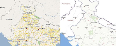
This blog post is for readers/students who want to know about the designing side of Y! India Maps. For our map product we designed both the map cartography and UI.

Map Cartography

Map

Maps cartography is the designing of the maps. Map cartography is a pure “information design” problem. There are two aspects to it – “what data to show at what zoom level?” and then “how to show?”. From the design stand point they combine together to create the desired effect. Thus we used the Visual Design in a way to assist the information (Data) architecture. We had a limitation in terms of what we can do – like we can not have a border on text, there were limitation on transparency etc. So we work largely with colors. Things that the users want to see more often have brighter colors or are enhanced (by changing the width, border etc); secondary information is subdued. Every zoom level had a purpose (objective) in terms of what they will convey. And also every zoom level had relation with the previous and next zooms. This was important as the map is interactive; on zoom the user should feel as if hes zooming. Zoom spec tried to connect both the relationship aspect (with other zooms) and the individual aspects (it shouldn’t look cluttered).

Map Tile some time in Nov. It all began with this... (this is Zoom 06 and you are looking at Delhi)

To see this location (with same zoom level) in current version. Click here – you won’t believe it!!

Hybrid

Though the design principles remained the same the strategy was a slightly different. The Data in this case was a supplement to the Satellite images. Though at higher zoom levels the things don’t matter much but as you zoom in the specs starts to change. As the city level starts to appear the Satellite image itself becomes a huge repository of information. Then you start to see what information is going to add value to the image below. If you are looking for your house and you know which locality you live in, you could navigate through locality and some landmarks through our Y! India Maps.

User Interface

We tried to keep the page as light as possible - as less images as possible. Another question I had been answering from the time I proposed it was “why right navigation”. Well there is a long story behind it, which i'll tell later. But we kept the info pane on the right just to experiment; but this layout suddenly started to make a lot of sense:

  • The Left became very less cluttered.
  • The is not break between the info pane or map area – as in other map site with left info/navigation pane.
  • The listings in the Search Result Page comes closer to the map. Its on the left on the right pane. Thus better visual connection.
  • The map which is the main information space get the Topish –Left space. Most viewable area of the screen.

I had to create a separate twiki page (internal web page of this product) with the explanation because so many people asked this and so many times…

Another important aspect was to keep the information (and the UI) incontext. So you will see the yellow message boxes appearing below in “Do more with maps” section (one that comes after you search for a allocation). We designed the UIs with full feature in mind. Right now I can say its just 30% of what we deigned for. The design is largely scalable as functions grow they will be added without major changes to UI design.

We never tried to coping anyone; we wanted to solve the problem with the best effect. Some differentiators of Y! India Maps could be -

  • Right navigation/info pane.
  • The Split of the top header marking the map area and info pane area.
  • Map being attached with its header than detached.
  • The use of ‘Color’. Which are broadly taken from Yahoo! Local (US) – the blue being a little more bright to add a little “life” to the UI.
  • The error messaging styles.

One thing that we didn’t think much was the Printable Version page. It still needs a lot of thinking and improvement.

Its encouraging to find that people have started liking it and writing about it - webyantra

It was real fun working on maps and we sincerely hope you’ll find it fun to use. Please do take some time off and post you feedback on the product. The stage is now set, its time to rock n rolls; hope this product goes a long way. Though I may not be there but I wish Y! India Maps - All the very best…

Wednesday, March 28, 2007

Google Header

I love Gmail but really hate Google's header. I was thinking of some solution for it...thought of a design. Though its not so great but still I guess would help to improve their design.
see a small screen shot at this link.
http://abhishek.iitr.googlepages.com/googleheader


Tuesday, March 20, 2007

Good UI ideas need not come from designers; but good ideas should also translate to good design…

Good UI ideas don’t just come from UI designers; they come from any where; at any time and by anyone. So why do you need a designer? Good question indeed. There is good reason why you should…

Now first thing to look about these “AHA! good idea” moments is there timing. If these ideas come very early in the conceptualization stage they are easier to accommodate. But the real problem comes when these ideas come at later stage. As I have been saying before design is built on decisions and they are like a pyramid of cards. If you try to replace a card placed some where at the bottom the whole pyramid can collapse. It becomes harder to design as we move up the pyramid. There are lots of dependencies that one has to take into account to add anything new to the design. Every thing in a UI is interrelated. Adding or changing can have a severe impact on the UI; a lot can change in order to do even some small changes.

This is where the designer comes into picture. Yes any one can get good ideas but what any one else can not do it to “translate” a good idea into good design. A good design fits into the scheme of things and blends perfectly with its interrelated elements. A good idea may look good in a specific use case; but may also spoil a bunch of others. A designer can make sure (if he’s good) to make that good ideas look good in all use case/scenarios/conditions. What designer can bring in is that multi perspective analysis to make sure it doesn’t conflict with any other elements on the UI and that the communication is not hampered. This is the beauty of design “make good ideas look good always”.

Thinking!!! Is all what ‘design’ is built on…the more you can ‘think’ the better (& more complete) design you can build. If you can think hard, your are already a designer :)

Thursday, March 15, 2007

Built on decisions

Design is all about design decisions…at every stage you are trying to decide what will work for your designs. These decisions came very early in design – be it deciding what product you want to make to how would it look to how would it work…

At all step you are involved in taking decisions; and success of your design closely depend on these decisions.

The most important part of design decision is how many parameters are involved in that decision. The more the parameters you are using to take the decision the probability of creating a good design is more. What it means is that your designs are designed for all those parameters. It like you have to create a protective cover for an art work; so you want to make sure that the cover takes care of ALL those things/conditions that “will or may” damage that art work. The same is for design; you try to make sure you cover all aspects that are going to affect the product you are designing.

Another critical aspect of design decisions is their “interdependency”. What do I mean by that? Well I mean is all along the design process you would be taking certain decisions at say ‘stage 1’. Now when you move to ‘stage 2’ you would be taking another set of decisions. But now these decisions will be highly depended on what you decided at ‘stage 1’. Thus all along the design you would be taking decisions which you be so inter depended that if you try to change a certain decision that you took at a lower stage the whole design would fall into pieces. It’s like a pyramid build of cards. If you remove a lower card the whole pyramid falls apart. This is because of these interdependencies of the design decision.

If you take one wrong decision you land up with a wrong design…and if you realize is late – you are dead!. Thus design is one profession where you need to be very sure of what you are doing. And to add to the complexity the decisions that are involved are very “subjective”, with each path/decision having certain pros and cons. This is where the real adventure lies? Is it?

But with thorough logic, analysis and understanding you can to a large extent reduce the unknowns of design and bring in some objectivity in design decisions. Thus design is not about creativity it’s also about analysis and research…find out the problem and the solution will find you…

Monday, March 12, 2007

'Degree of Freedom' in design depends on…

We have come close to launching a product in some time now. When I look back I realize that what I realize that my “degree of freedom” to design closely depended on – Product Manager and the Front end/Web developer.

The reason I say this is because these are the two important people who really defines what you can do as designers. The Product Manager is product owner of the product thus he is the one who take the final decisions in terms of Business strategy, Engineering and also Design. When I look back I realize that I could ‘explore’ so much because the Product Manager allowed me to do that. It’s very important for a designer to have confidence of the Product Manager and the team. How much you can explore depends on how much “trust” they have on the designer/design team. This is very critical. Also if the product manger is willing to experiment there is a lot of freedom that the designer gets. What’s important here is that both the Designer and to some extent the Product Manager should “own” up the experimentations and their decisions. The most difficult part in design is this ownership of design decisions because of the subjective nature of design. So both Designers should own both the success and failures of UI. And I know its easier said than done; it’s a great responsibility. But the PMs should also own a bit of it as they are also part of most decisions.

The reason I have mentioned the Web/front end developers is because s/he is the person who is responsible for the implementation of the designs. Design doesn’t end by building JPEG screenshots but in final HTML (that what people actually see). And I know building the Front End is whole new ball game. They are essentially two different set of operations with both work with “different parameters and different decisions”. Design is subjective while Web development is very much mathematical. If you are lucky to get a good front end developer you can experiment a lot; else you are restricted by the web devs limitations. Thus the degree of freedom closely depends on the web devs also.

There are a lot of other people also who influence designs. But I guess these are the two very important people who really define what a designer can do. Over all as I have been saying…

The product is as good as the people who build it…to build innovative product you need creative people all along the product cycle.

Saturday, March 10, 2007

Designing for the New Age Web

I recently spoke in “National Conference on Web 2.0” held in Bangalore. The topic that I touched was about the challenges for designing for Web 2.0 products. Web 2.0 has essentially changed the way we now have to think about UI design. It has added a lot more to think about now in terms of designing. I’ll touch upon some of them in this article.


Web is changing

Web is changing; and why should we be surprised by the change? Even the environment of the users is changing. Their economic, social and cultural environment has changed; and we web has been one of the instruments of this change. Even the other technologies have brought in new needs for web products. The famous examples are – Flickr and You Tube; if there hadn’t been digital cameras = digital photography/video these won’t have been existed.

These new found needs are pushing the way we have to think about the next generation of products. What’s important to know for designers is to be able to see these upcoming ‘needs’ and track these changing environment of users.


Designing for Web 2.0

Looking at the changing trends and evolution of web technologies are pushing the limits to how we design on the web. The two important aspects that AJAX have changed are the –

  • interaction design
  • information design
  • One critical aspect that has been added to the arsenal of the design is TIME.

A better control on time has brought in a whole new change in the way we have to think about Design. Now with power to control elements in time a whole new concept of animation comes to picture. And with animation comes Story. Story that can be used to effectively inform the user about the change in the state of the system.

Let’s look at this new design paradigm change:

  • In-context Operations
  • Animation / Story
  • Continuity
  • Multilayer of information
  • Multitasking


In-Context Operations

Operations that needed another screen now can be done “in context”; user can be present in the state where s/he wants the operation is done.

Animation / Story

A good example of animation is from My Yahoo! When the user click on the ‘Close’ button the section blurs out and is removed. The lower block moves up.

These 2 set of animations – blurring + movement is what builds the story. The story saying “I have closed and now the place emptied by me is taken by another section”. In this case the user doesn’t actively participate but witnesses the change of state of the system. Now when you are implementing this the developer will ask how much time we should give for this to blur and the lower block to move. Then suddenly you realize that you are now dealing with “time”. This brings in a whole lot of thinking.

Continuity

What In Context features have brought are a lot of controls on the screen for a user. User can do multiple operations on the same screen. What it means is there are now multiple “trigger points”. Trigger points are objects/behaviors on screens that trigger operations like buttons, hover actions, roll over actions etc. Not the designs have to thoroughly understand the various states of the UI.

  • What if the user starts an operation and clicks on some other trigger point mid way through the first operation?
  • What are the dependencies of one operation to another?
  • Will or how will the other trigger points change if one operation is done?
  • How will they conflict with one and other? How to solve it?
  • How will the one operation conclude and how the next one will appear? What should be the feedback?

Multilayer of information

Now with AJAX the same component/place holder/ information holder can be used to convey more information. The two basic ways of deign are –

  • Either the additional information came in a different layer
  • It can be animated - removing one and showing another after an interval of time.

Multitasking

New web technologies are allowing the designers to think about allowing user to do multiple tasks at the same time. The one famous example is the new Yahoo! Mail which allows the user to do multiple tasks at the same time through its Tab design.

What does it mean for designers/product managers?

This means that the “Degree of Freedom” to think about design has drastically increased. The new aspects have added a lot for designer to think before they find a solution. Also it means that now there is more probability to go wrong in design.

  • So as the degree of freedom has increased there is more need to think about design in product development cycle.
  • More is the need to conduct User Testing to make sure you are on the right track.
  • Create new set of Web 2.0 patterns for designers.

Tuesday, March 06, 2007

Design an Adventure?

Can design be adventurous? Yes of course, it actually is. When you actually work on design there are a lot of decisions that one has to take. And for most of these the designer doesn’t necessarily have user research data. Thus most decisions are built on intuition, experience, understanding etc. So for most of this part there is complete “Black out” about how will the users reacts to it. You can never be sure till you launch the product and start to get feedback. Thus design is pure adventure…you don’t know how the design will go with users. You will be biting your nails till the design goes out.

A lot can go against this as well; that ideally you should know every bit about the user and should design for it. But practically speaking this is impossible. My little experience in design has showed me that “most” UI designer are afraid of taking decisions in these case. I feel that’s the best part – a little “sensible” and “logical” experiment is what makes design so exciting, right?

Failure is just a step forward to success :)

Be a responsible adventurer…and enjoy your designs.