Monday, October 17, 2005

What you 'Get' is what you 'See'…

There has been an interesting posting on Ok-Cancel…about the “end of WYSIWYG (what you see is what you get)??”…also you will find ‘Usability Gurus’ talking about this amazing idea used in ‘Outlook 12’...


“Ok…so?? This is same as ‘Previews’ we used to see…” so what the whole fuss about??? I have been using softwares like ‘Photoshop CS’ and ‘3D Studio Max’ and I’m not excited about this ‘WYGIWYS’ (what you get is what you see) because these software are doing this for quite some time…


It’s not a very substantial leap into the future…its just ‘intelligently’ using an existing style…I believe the hype is created by ‘some’ to scare engineers and management so that they would get a reason to ‘pay’ for courses conducted by ‘some’ on this so called ‘emerging new UI paradigm’…


The question is how far can this paradigm go…its easy to show commands like “Bold”, “italics” or (filters as in Photoshop)…what about “Save”, how about “Send Message”, how about “Inserting an Image”…command like “Break”…how to show a process??? It can show the end result??? How to use it when VISUALLY nothing changes – Export, Save, Print, Zoom…how will we show DELETE in preview??? So can we say WYSIWYG is OUT???? I don’t think so…


But a mix of BOTH…well I must admit…‘very interesting’… TO put it metaphorically design is like a game of ‘Quake’…there are lots of ‘guns’…where every gun has its own specialty…so when an enemy comes…one has to decide what gun is effective to tackle that enemy…it’s the same in UI…every design issue has a gun…you have to decide the right gun and shoot the problem…but saying a ‘Rocket launcher’ is better than a ‘Shot gun’ is not fair…as both solve different issues… :)


To add the great “Ribbon” tool bar…why can I have commands on my work space??? Why do I have to go on top header to click a tool…why can’t I have the tool bar a Right Click (right next to the place in am typing or working???)


You may find my ideas foolish or childish….but that’s ok… :)


Have a good day…
Wednesday, October 12, 2005

CTZ news for Citizen Journalists

It seems that the field of technology is moving with the speed of light. When you get a GREAT idea and you ‘think’ it’s ahead of its time…and sudden you read some article on the same subject…and then you keep thinking…IS THE WORLD MOVING FAST or I’M TOO SLOW…

I am working on a project for the past one month on building a comprehensive system to support Citizen Journalism and Freelance Journalism… its more or less complete now… during all those one month, I kept telling my self ‘woow this should be ahead of its time…’

But then I read this News on BBC... (http://news.bbc.co.uk/2/hi/technology/4330690.stm)
...and I thought…oh my GOD…my idea won’t be new for a very long…

Before my so called ‘new idea’ gets OLD…I decided to publish it on my blog…so that I can sleep in peace…believing that it was ‘NEW’…though my project goes beyond what is mentioned in the article…but it’s no doubt a step towards my concept.

So here are some extracts from the Report of that project


A concept of an open NEWS portal for Citizen and Freelance Journalists

Abhishek Kumar,
National
Institute of Design,
Ahmedabad,

India

Introduction
With the evolution of web and mobile technology, citizens have now tremendous power to speak out their view points and be heard. The London bombing and Tsunami saw the citizen journalism coming to limelight. Again Web 2.0 technologies including social networking sites have opened up the web for public. Even though ‘Blogs’ have now slowly being recognized as good source of expression and reporting, but still the concept of it is more ‘private’ (to author) in nature. The concept of the portal is to build a platform where every one is free to express and a portal which is ‘by the people and for the people’. In relation to the changing trends in technology and society; this project was to create a medium for the society to report and discuss events that shape up peoples lives. It tries to converge the existing technologies to answer the changing scenario in journalism. The difference between this portal from existing ones are that it minimises the human interference in selecting, deciding and editing the content. This is an attempt to remove human biases from the reporting and to bring in multiple perspectives of events and happenings from local people.
It tries to holistically conceptualize a sustaining system which can assist people not only to access the News but also allows people to post articles in all forms and also provides them with facility to sell those articles. It uses newly evolving Information Architecture paradigms of tagging or popularly known as folksonomy. Folksonomy is an excellent tool for reference purpose; but in this project it is also used for controlling and to create a browsing experience. As the content of the pages would be dynamically (that too with very less control on content) changing the tagging becomes very important controlling factor. Also as the ‘NEWS’ is primarily a browsing experience it tries to build up a system which supports ‘browsing’ than search. The project is built up along with a business process which would support such sites, because such project would be difficult to sustain without a proper support.

© Abhishek Kumar, 2005


Thanks
c ya
bye


Tuesday, October 11, 2005

New Method for Info Graphics...

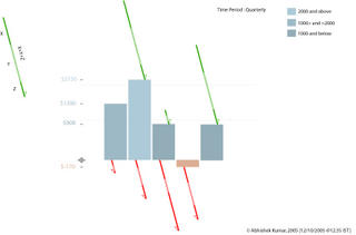
While working on an assignment on Data Visualization, we (me, Raina and Medha) came up with a Charles Minardish Graph for a Financial Data which show the flow of money in and out of an organization. You can see the assignment on Raina’s Blog.

It was just an overnight assignment and got finished the next day. But some how this idea of representing the financial data in a FLOW got stuck up in my head. The idea of representing the ‘INs’ (earning) and ‘OUTs’ (spending) in business seemed really sensible.

So I yesterday explored some ideas and came up with a design which can represent the ins, the outs and also the flow…in a holistic way.

I call it ‘Bar-fin charts’ for ‘Bar chart with fins or Bar chart for finance’ ;)

Components:
1) x-axis
2)
y-axis
3)
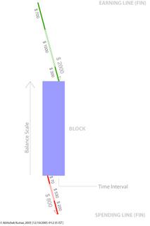
block – the rectangular block
4)
fins – The arrows that represent Ins and Outs…
The Dimensions of data that can be represented:

1) Time Interval
2) Total Balance
3) Total Spending
4) Components of Total Spending
5) Total Earning
6) Components of Total Earning
7) Making of financial thresholds.

Time Interval

The time interval is represented by the x-axis of the Block. The financial information is chunked into time intervals (monthly; weekly, quarterly, annually, etc.) so that it becomes easier to notice the comparison.

Total Balance

Total balance is represented by the y-axis of the Block. The division has to be decided based on data.

Total Spending

Total Spending is marked by the LINE (fins) on the lower side and marked by Red color. The line is tilted to 15 degrees from vertical with an Arrow marking to show that amount is being removed from the block. The length of the line marks the value of total spending. The scale of the line should match with the scale by the y-axis of the block. The side which has the arrow will label the Total Spending.

Component of Total Spending

The component is represented by the breakage or makings on Total Spending Line (fin). The values would be marked by the length of the line.

Total Earning

Total Earning is market by the LINE (fin) on the upper side of the block and marked in Green color. The line is tilted to 15 degrees from vertical with an Arrow marking to show that amount is being added to the block. The length of the line marks the value of total spending. The scale of the line should match with the scale by the y-axis of the block. The side which has the arrow will label the Total Earning.

Component of Total Earnings

The component is represented by the breakage or makings on Total Earnings’ Line (fin). The values would be marked by the length of the line.

Making of financial thresholds

In order to make the graph more readable color in the Block can be used to mark the levels in finance. Like – Dark blue for above $300, Blue for $300 to $200, Light Blue for below $200. Grey scales of a color can used to make this parameter.


If any of you...ever use this graph...please do let me know...thanks

Gud Day :)

Sunday, October 09, 2005

Understanding Infographics

I was attending a Workshop on Information Graphics. While I was watching some path braking Info graphics I was...wondering what makes them so great...
Let see some great examples here...these graphics didn't just represented data but helped in understanding a problem...the representation lead to a solution which would have been impossible to achieve without them...

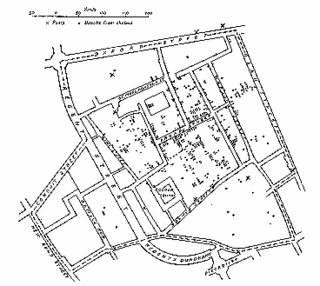
The 1854 London Cholera Epidemic by Dr. John Snow

This graphic maps the Epidemic data on a Location Map. The map marks the location of patients in London. This graph leads Dr. Snow to pin point the source of the epidemic – a Water Pump on Broad Street which had contaminated water.

The Periodic Table

Dmitri Ivanovich Mendeleev studies the properties of elements and came up with a periodic table (the one above is a modern version). Table started making sense and gave way to discovery of new elements…

I kept thinking what is it which made them so powerful....

The Golden Question

How could they solve a complex problem of data structuring??? What I mean to say is that there are so many ways of arranging the same data for example…Dr Snow could have arranged the same data as per DATE, or by AGE or may be by Demographics or by Financial Status of patients…which would not have let him to the conclusion which he was looking for…

Just because he chose the ‘Locational’ facet of the data that he could arrive at the ‘result’. It could be a matter of debate as to whether he accidentally took this facet or he thought about it. But for now lets leave alone this for historians to figure out…

Let’s take the other example…of periodic table…had Mendelev taken some other facet of the data…he wouldn’t have arrived to such a perfect solution…though it may be unfaire to say it was accidental…but still getting the right facet to organize a data made the this thing a ‘HIT’…

So the conclusion is that for making an information graphics it’s VERY IMPORTANT to choose the right facet or axis to organize the data which eventually could give the PERFECT RESULT…

So, how to figure out that RIGHT facet????....hmmm good question…hope to find some solutions in future...

if you want to know more about History of Info-graphics you should visit the site
http://www.math.yorku.ca/SCS/Gallery/

Have a Nice Day…

Saturday, October 08, 2005

Thoughts on 'Customization'

While working for a project during my internship I came across this difficult aspect of softwares...called the 'Customizability'...

So when we allow users to customize the UI...then...the design moves in difficult waters...'How to control the UI consistency?' ; nobody asks the user 'How much customization you need?' or 'Are you not lost in customizing the UI?' or the golden question 'Is it making your life simple???'

Some thoughts on customization...

The major problem in customization is that the designer looses control over UI. But still it’s a designers responsibility to ensure that user do not make their page un-user-friendly. Again just because it is customizable does not mean that the product (default design) should be badly designed. The default design should be a benchmark for user in usability readability and design. They should customize their page with reference from the default design.

Cultural Models & Interaction Design

For my 'Cross Cultural Study' we had to analyse the Web sites for different cultures...the approach I took was to use the existing cultural model...the idea behind it was to get some patterns...which can be applied to other sites and thus in short building a kind of a formula which can be used in 'designing' for other cultures...here are some of extracts from the Report of that assignment...


Discussion
Hosftede model is good to give a broad perspective of what a culture is. The important point to

note here is that the parameters given by Hofstede are all relative values. So it is not correct to state that certain culture is “Feminine” or Power Driven. What Hofstede model states that one culture is more or less “Feminine” or what the case may be, than the other culture. One can broadly understand one culture with respect to the other. In my opinion that is the strength of that model.
When it comes to details of analysis, expectation or prediction; this model alone does not work.
And I don’t think this model was developed for that purpose. To do an analysis one has to experience the culture or the context to understand the people’s behavior and their liking or disliking. The situation becomes complicated when we try to analyze any artifact or a cultural opinion. The outcome of any artifact or opinion is simultaneously effected by all the 5 factors plus their oppositions- Power Distance, Individualism, Collectivism, Masculinity, Femininity, Uncertainty Avoidance, Long Term Orientation and Short Term Orientation. At it is still unpredictable as to what factor dominate and shape up the artifact or the opinion. Again one should not undermine the importance of Context in which that artifact or opinion is built.


After hours of trying to get a pattern or being able to use the Hofstede’s model unsuccessfully for
analysis of websites I have reached to a conclusion that his model can not be directly applied for analysis. With study of Halls and Hofstede’s model I came to a conclusion that these models can be clubbed and modified in order to make a model that can to an extent work in analyzing websites. This little formula is based on very few data and can be challenged. This formula seems to be working in my context and has been formulated after studying few patterns in the display of the page and information. This formula is based on the findings that High/Low Context, IDV, MAS, UAI and Religious Orientation can be primarily being identified as the influencing factors in a website...

this work is just a begining...to finally come to a concrete solution...i requires a lot of deep study and anlysis...but I was happy becoz this formula was working to some extent...

God bless you :)

p-Podcast for 'Picture Podcast'

While working on one of my assignment (a system for a Citizen Journalism), I stumbled upon an idea… ‘Why can’t there be a picture podcast?’ a mix of still images changing over an audio…

As you might have read about the latest rumors about Apple launching a video-iPodcast…
(
money.cnn.com/2005/10/05/technology/personaltech/apple.reut/index.htm)
... this picture podcast idea is pretty simple in a way…it’s composition of audio + still images…which change over time based on audio…and this roll over can be automatic or the user uploading this podcast can customize the time of roll over of every image...


The advantage here would that we don’t have to upload and download a video (which has a much larger file size) but upload images which are ‘time tagged’…so an audio is uploaded in audio format but images are uploaded with an addition on time tags…
While downloading images and audio are downloaded; and at the client side these are combined together to make up an Audio-Video file…which can run on windows or real players…

While playing the images rollover based on the time tags embedded along with the audio…so people will get a multimedia experience...i guess it would be interesting...

Imagine getting audio and images together for an event…may be like ‘London bombing’…viewing the horror by both audio and images…it would be a powerful medium to express and inform…

I'll be posting some of my other thoughts...

Good Day... :)

Friday, October 07, 2005

Introduction to Design

Hmmm…such ‘Information Rich’ title… “Introduction to Design”
“Introduction to Design” as in ‘Introducing…iPOD’
“Introduction to Design” as in “London to New York”…

What I meant was the latter… ‘Introduction’ to ‘Design’…

Are you wondering what is ‘Information Rich’…well by ‘Information Theory by Shanon’…A statement which has ambiguity is information rich…means it may have multiple interpretations…hence Information Rich.

So first we start by introduction…one of my friends gave me this great idea…that I should ‘Introduce’ my self… (wooow why didn’t I think of it…)

I’m Abhishek, wanting to be an architect but turned into a New Media designer then struggles to understand New Media so drifted to Usability, Interaction Design and Information Architecture… = complete MESS (Hence proved)...I hope people now would have sympathy with me…

With all due respect to design gurus I’m unnecessarily trying to redefine DESIGN.
Design is not about drawing skills, graphics, color, interesting forms or aesthetics. It a was of life and way of looking at things…its as close to logic and reasoning as it is to aesthetics and a pleasing experience…

Design has always been popularly associated with creativity and innovation… but then creativity and innovation are as much a part of other fields as in design. Isn’t a person who designs an efficient motor engine a designer? Or person who designs a rocket is a designer? Or a person who designs an innovative way of serving coffee a designer??? They are all designers to me…Then isn’t design a very broad term to use??? Or are their layers or facets or levels of design??? And then what are we taught in design schools??? Which facet?? Which layer?? Or which level?? What is a role of a designer????? I don't have answers to most...but I hope i'll be able to answer them in future...

With all the little understand that I have…I believe…
DESIGN not only integrates elements needed to achieve a solution to a problem but also creates an ‘interface’ with its Human Consumers/Users…
And its success lies in its capacity to both solving a problem and the solution be correctly understood by users/consumers (and create need, interest or a lasting impression to survive)…and that is ‘CREATIVITY or INNOVATION’ in Design…

I’m leaving you with these thoughts…

HOW to start a BLOG???? some one please give some ideas...

When the whole world seems to be writing about their lives. I thought “Why should I be left alone?”

So folk here I am writing my first blog - wooow, its amazing to see my Microsoft Word marking the word “Blog” for a spell check. Great!!!...So my Microsoft Word 2002 is as novice as I am :) …gr8 so it means I’m not too late in starting one for myself ;)

Why do I call my blog “THE DESIGN AGE”…you would be surprised to know that I’m a student of ‘Design’ in a ‘Design Institute’…so…‘Design Age’ makes sense…does it?

The reason I started this blog is…becoz I believe I have lots of ‘IDEAS’ in my head…and becoz no body around me is ready to listen to it…so I have left with no options except to write them down in my blog and HOPE…SOME DAY…SOME ONE would read it...(I hope so)…and get INSPIRED (don’t laugh)…

Meanwhile you keep waiting for my next posting as I’m desperately hunting for ideas to write in my next posting…hope I wouldn’t keep you all waiting for long…(God bless me)…

Have a nice day & God bless you…