Let see some great examples here...these graphics didn't just represented data but helped in understanding a problem...the representation lead to a solution which would have been impossible to achieve without them...
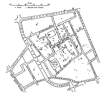
This graphic maps the Epidemic data on a Location Map. The map marks the location of patients in London. This graph leads Dr. Snow to pin point the source of the epidemic – a Water Pump on
I kept thinking what is it which made them so powerful....
The Golden Question
How could they solve a complex problem of data structuring??? What I mean to say is that there are so many ways of arranging the same data for example…Dr Snow could have arranged the same data as per DATE, or by AGE or may be by Demographics or by Financial Status of patients…which would not have let him to the conclusion which he was looking for…
Just because he chose the ‘Locational’ facet of the data that he could arrive at the ‘result’. It could be a matter of debate as to whether he accidentally took this facet or he thought about it. But for now lets leave alone this for historians to figure out…
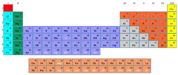
Let’s take the other example…of periodic table…had Mendelev taken some other facet of the data…he wouldn’t have arrived to such a perfect solution…though it may be unfaire to say it was accidental…but still getting the right facet to organize a data made the this thing a ‘HIT’…
So the conclusion is that for making an information graphics it’s VERY IMPORTANT to choose the right facet or axis to organize the data which eventually could give the PERFECT RESULT…
http://www.math.yorku.ca/SCS/Gallery/
Have a Nice Day…
No comments:
Post a Comment