Wednesday, February 22, 2006

BIG IDEAS come from small thing around us…

Some thing nice just happened…

As I had mentioned earlier…field study resulted in an interesting ‘observation’ on people's behavior which gave a small idea and which finally resulted in a BIG CHANGE in our approach to our ‘Product’ :)

There is some thing new that I realized recently…one need a good EYE to do an OBSERVATION…its very easy to loose out small subtle things which appear so obvious and are taken for granted…but these are the things that can really change the way you look at things/behaviors…

I guess that’s the most precious aspect of design…be sensitive and open…be observant… allow and accept results/ideas… KEEP THINKING….and creativity will fill you up…

Wednesday, February 08, 2006

Designing + Managing a Software Product Design

At Yahoo! I’m designing a product (something that I love doing :) ). What Yahoo! had was a new technology & what I’m doing here is that I’m using that technology to make a new product for Yahoo. This is great opportunity for me because not only that I am trained into designing products (and not only UIs) but also that I’m really passionate about ‘designing'. I have been quite lucky that I have been given full liberty and great amount of “charge” of this project.

There have been quite a number of learnings as this project is moving. What I have realized and what I’m learning is that designer needs to be good manager. As a designer what I need is to innovate, be creative and bring new ideas to the table; and as a manager I have to break up the designing process into phases, where each phase leading to some conclusion/learning and the next phase building on the learning of the previous one, constantly evaluate results, build and modify timeframes (based on conclusions from the previous phase which might sometimes be surprising - It very often happens when your tying to do something new. Where the conclusions can not be very definitively predicted.) And then to make sure the project is completed “satisfactorily” with in time frame. It’s one learning that one can not get in an academic environment and one that is very vital for a designer.

I’m not a management guru and this is not from any book. It a reflection of what I’m doing or have done. It’s sometimes good to sit back and ‘reflect’ on what you are doing or what you are learning…so here it goes… with my experience this is what one needs:

VISION – a vision to see the not only the results but also in between milestones.

ANALYSIS – to be able to break that vision into reasonable milestones and to analyze the problem statement.

FOCUS and CLEAR – it very easy to get carried away as a designer and lose track of the original problem statement. A clear focus brings a better design.

FLEXIBILTY – both to accommodate new ideas and to respond to it (by modifying the project plan to accommodate the findings). With whatever little experience I have most often a good Field Study results in some surprises to designer/user study researchers; and it’s very easy to keep a blind eye to them if we are too biased or in love with our designs. We generally tend to see thing the way we want to, things that support our assumptions and ignore the real learning.

What I have been missing out is ‘People’s Skill’. That’s because till now I had a good experience from people. I have been a little lucky. So I would include all that one I face it or get a LEARNING from it ;)

It’s an important aspect though…

Data Viz...

Infographics is very interesting area. It’s very powerful tool, which help us to present a complex data in a meaningful graphics. And guess what it’s not as simple as it looks like…

The first phase of deasig is to research on the data…what has to be conveyed??? What is the point of view??? Which relationship of the data is important for the graphics to be effective???

Now my research started with the data given to me…(it was an academic exercise)

If you look closely this data has numerous relationship between each other…
1) Comparative relationship of each data between India and China
2) Comparative relationship of data of ‘one countries’ between years 2001 to 2003
3) Comparative relationship of data across India-China between years 2001 to 2003
4) Comparative relationship of sectors…
5) Comparative relationship between ROI and ROE

Now my objective of this graphics was to bring out the above comparative data is a way such that it highlights the comparisons and thus to bring clarity.


The Design Method

To show various comparisons I used various methods:

  • The color code to differentiate between India and China (India in blue and China in Red)
  • The change in Typography to differentiate between years…
  • A light colored dotted line to guide the ‘eye’ to bring out the comparison in data across year.
  • A straight line to help in comparing the data between the two counties in the same year.
  • The gird on the back help in finding an approximate values…change in grid line color and width marks the threshold, which help in judging the values.
  • Increase in the typography and position of values to ease in perception of the grid thresholds.
  • Positioning ROE and ROI across in order to see the relative value. I came to know that the relationship of ROE and ROI may not be very relevant or important.
  • Use of graphics (icons) for sectors in order to speed up the perception.

Patterns in ‘Data Visualization’

As apart of our course in ‘Data Visualization’, we were asked to categories different Data visualization techniques. We took a little path to solving this problem…we took the challenge to solve the mystery and create a formula for ourselves…

The process started by collecting about 900 images of various examples of data visualizations. Next came and extensive session of “Brain Storming”…

Brainstorming threw quite interesting view to data visualization…things when categorized gave an interesting picture…

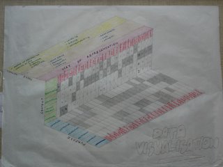
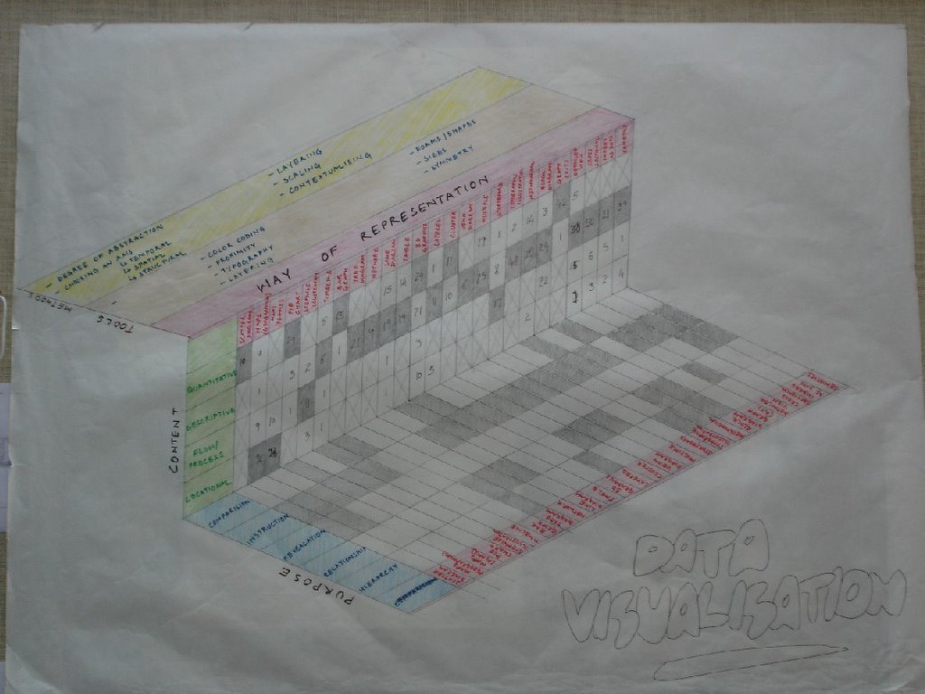
There are various facets to data visualization…
1. Tools
2. Methods
3. Ways of representation
4. Purpose
5. Content

Where Tools were graphical techniques primarily used to distinguish one data from the other…

Methods were various factors like choosing axis, degree of abstraction…etc…its various decision a designer takes before deciding the graphics.

Ways of representation were know “outputs” like pie chart, bar chart, illustration, maps etc…

Purpose is the purpose of making data visualization like instructional, comparison…etc

Content defines the kind of data…like quantitative, descriptive…etc

The next part was little interesting…we realized that Content Purpose and ways of representation were closely connected.

Not only that we sorted the 900 samples into a 2 way matrix to figure out how closely are they connected.

This was an early exploration of the assignment…

Hitchhikers Guide to the Earth

We generally associate places or cities based on what we hear or experience from them…and we tag them as ‘Historical’, ‘Religious’, ‘Peaceful’, ‘Beaches’, ‘Mystical’ ‘fun’ etc…

So why not have a web-based application running on GIS (like google map) where we allow people to ‘tag’ places with their terms…not only that allow them to “Refer” or post in their experiences related to that place or city. Also if we can store user’s choices we can do a ‘Tag match’ or ‘profile match’ (with other users) and throw in suggestions to the user…like as per your liking these are the places you would like…a travel planner should also be a part of the system. People can suggest places to stay or travel also…which can make the system more comprehensive…

Powered by CBIR (content based image retrieval) we can also “find/search” places based on the uploaded image ‘query by example’…with a descriptive search also I hope we can also sort our and suggest places to visit.

As far as business model is concerned there can be a huge scope for advertisements for travel agencies, hotels etc.