The first phase of deasig is to research on the data…what has to be conveyed??? What is the point of view??? Which relationship of the data is important for the graphics to be effective???
Now my research started with the data given to me…(it was an academic exercise)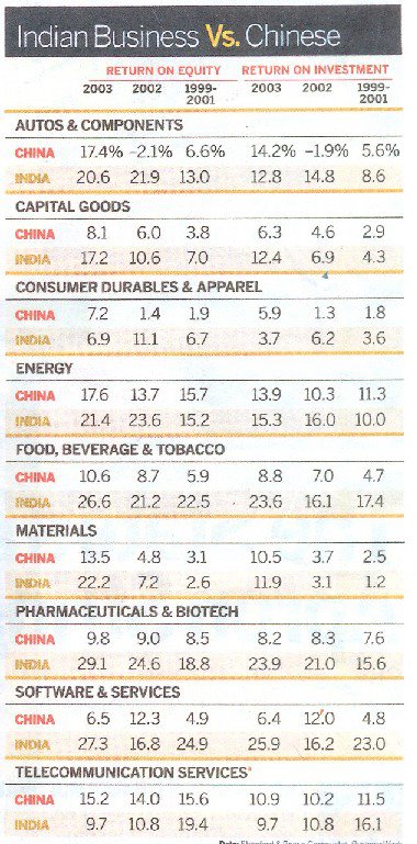
If you look closely this data has numerous relationship between each other…
1) Comparative relationship of each data between India and China
2) Comparative relationship of data of ‘one countries’ between years 2001 to 2003
3) Comparative relationship of data across India-China between years 2001 to 2003
4) Comparative relationship of sectors…
5) Comparative relationship between ROI and ROE
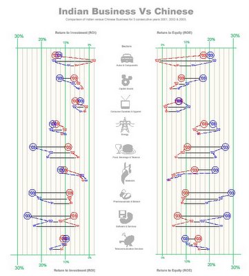
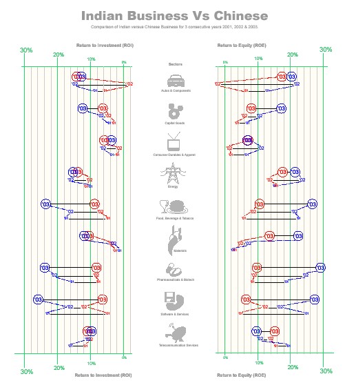
Now my objective of this graphics was to bring out the above comparative data is a way such that it highlights the comparisons and thus to bring clarity.
The Design Method
To show various comparisons I used various methods:
- The color code to differentiate between India and China (India in blue and China in Red)
- The change in Typography to differentiate between years…
- A light colored dotted line to guide the ‘eye’ to bring out the comparison in data across year.
- A straight line to help in comparing the data between the two counties in the same year.
- The gird on the back help in finding an approximate values…change in grid line color and width marks the threshold, which help in judging the values.
- Increase in the typography and position of values to ease in perception of the grid thresholds.
- Positioning ROE and ROI across in order to see the relative value. I came to know that the relationship of ROE and ROI may not be very relevant or important.
- Use of graphics (icons) for sectors in order to speed up the perception.
No comments:
Post a Comment