I have split this blog into 3 sections
one where I' posting my 'Ideas' http://abikr01.blogspot.com/
the other my Academic works done in NID http://abikr02.blogspot.com/
the last one is for thoughts / Articles / Reflections (what ever you want to call it) http://abikr03.blogspot.com/
Please do visit them...
thanks
Saturday, December 24, 2005
Wednesday, December 21, 2005
People’s “map” powered by Folksonomy and Web 2.0
I recently went to Bangalore and I boarded an auto rickshaw as asked the driver to take me to ‘IISc’ (Indian Institute of Sciences); to my amazement he didn’t know the place…Strange?? I thought. Later I boarded another auto with the same result. But (with God’s wishes) I got a gentleman who know the place and told the auto driver to take me to “Tata Institute”…ooooh why didn’t you tell me so replied the auto driver…I know that place…
Well I’m sure this was not the first and the last time I have face this problem and I’m sure neither have you…the local and popular NAMES in a city are sometimes quite different from the OFFICIAL one and some times create a communication problem especially to a new tourist/visitor.
That’s the genesis of the idea… “Why not to build a comprehensive People’s Map”
If we can have…Flickr & Delicious why not a Map where people Tag in place with their popular name. The names can be presented as a Tag cloud…or in hierarchy of popularity…may be presented in a drop down on a right click on the official names presented on an online map like Google Map, MSN Map or Yahoo Map…it can be an application that works on top of these applications…or can be integrated with them.
Sunday, November 27, 2005
CTZ : Design Process
CTZ News
Open News portal for Citizen Journalists...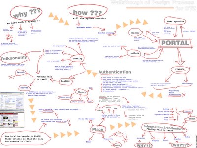 from my class room project...
Open News portal for Citizen Journalists...
 from my class room project...
Tuesday, November 22, 2005
La planète de mémoires
The best part of ‘New Media’ is that…it gives you enormous power to express your self. ‘ART’ as they call is all about expressing yourself and generate ‘feelings’…or make you look at things ‘differently’…
This is my ‘small effort’ to look at things ‘just a little’ differently. This is part of my academic project…which I want to share with you…
IDEA
The genesis of ‘La planète de mémoires’ came from my previous idea of exploring the possibility of projecting images on trees. The idea was to explore the possibilities of projecting images or video in a VOLUME of space rather than on a flat SCREEN. Initially the plan was to project only one projection on the foliage of a tree, but then came the question that as this is a volume space why not project multiple images and create a moving (real time) 3D collage on a volume of space. But due to some reasons the implementation could not take place. But this idea lied latent before I stuck up with another idea – ‘Why not recreate a 3D surface and in case of projection we can have backlit screen.”
This idea is just an exploration of looking at pictures in a different way - spread into 'space'. With digital cameras, we are all flooded with images. The number of images in our lives is mounting so high that we rarely take out time to see them. It display is a Globe (sphere) with small cubes all aligned together inside them. Each side displays a portion of an image so that the combination makes a substantial part of that image. But to be able to see the image one has to conciously stand in position to make sense of it. Else we only see them in parts- as collage of memories (images) in our life. With a projector on the top it also allows you to project an image on any surface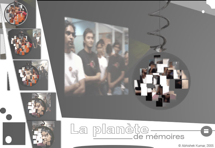 …from my project report
© Abhishek Kumar, 2005
Sunday, November 20, 2005
Asset (RFID) Tags for Intelligent Buildings
The concept of intelligent buildings has been here for quite some time. So I’m not sure where what I’m thinking has been already implemented or not. I was trying to find a project using ‘RFID’ tags, when stumbled upon the idea that “…if I can get a real time data of people inside a building, I can very well build an Intelligent building…”
I searched the MIGHTY ‘internet’ (which is still controlled by the
I came across the web site http://www.aeroscout.com ...its a company which produces Wi-Fi enabled active tags that can be read from a distance of 60 mts inside a building and to about 100 mts outside.
With this kind of technology if I can get a real time data of how many people and where they are inside, then this is what can be done:
Energy Conservation
- Lighting
- Lighting controlled by number of inhabitants and their movement.
- Switch on light where ever needed.
- Control the Lux of light needed based on work and people.
- Switch off lights where not needed.
- Not only lights but other equipments can also be switched off/on based on the need.
- Air conditioning/Heating
- Switch off or on system depending on people.
- A personal cabin can be automatically controlled by his/her preference.
- The blowers and vents can be controlled depending on where the people are.
- Auto start by entry into a building. When an employee parks his/her car his/her cabin’s A/C can start so that by the time he/she comes in its cool enough with his/her preference.
- Backup
- Backup system for electricity can be provided to specific area , again based on the requirement and number of people.
Security
- Building access
- Building access can be provided by authenticating by RFID tag.
- Public Address System
- In case of emergency/fire portions which have inhabitants can be specifically/effectively addressed.
- Fire fighting / Rescue
- During rescue operation RFID tags can track the number of people traped up in the building.
- Monitor Assets
- Assets like machines or equipments can be tagged and monitored.
- Track personal cars in building parking lots.
- Even track individuals in huge building premises (though privacy issues are there but there could be a design solution to tackle the problem)
- Even the tag can be used as a digital key to secure computers, almirahs, shelves, storages, intra-payments etc.
The RFID tag ‘holder’ itself can be designed to perform multiple tasks like it can work like a ‘pen drive’.
But no doubt there will be privacy issues…but I hope we can find a solution to that...
You can ignore...because its just 'an idea'...
cheers :)
Friday, November 18, 2005
the User Experience...(part II)
I blog just to share my ideas…that to in a very generic way...
But I thought I should write more into details about my previous post…as one anonymous reader has pointed out…
I guess the idea quoted in the previous posting is not unique…it’s just that I realize a system exists…it will be a huge topic to debate and research…but if I have understood correctly Jesse James Garrett “Elements of User Experience” also in a way states these factors…though he believes its in layers while I believe they are equal and effect each other more strongly…
But someone in the field of UI may (I hope) accept my argument that these are related and I explain this with an example…
Let’s look at various perspectives…
Suppose we start with finding the commands required…and arrange in a logical sequence (information Design)…how many commands are required…which ones are more important >> how many commands we need to add will define the interaction…can all commands be presented to user… >> UI elements are decided by what function each command performs…where it is placed…either all buttons or drop down or mixed >> also the visuals…whether all are in one row or in multiple rows…what icons are required…how many and how to make them different from already existing ones but yet should look like a part of the family…does it starts to dominate the other commands >> Usability consideration would be…are all the icons understood by user…is the terminology of the command correct…are the buttons spaces correct…is the interaction or UI elements fit into the metaphor of existing tools/commands…
So the ‘Experience’ of using that tool bar would come as combined effort of all these factors and not one…if the icon is not properly understood then…even if it is beautifully designed will spoil the experience…or if it is usable but doesn’t look good then also the Experience will suffer…again if the information architecture is not perfect usability will suffer and even a good icon wouldn’t bring the experience…
If we find that there is not enough space for 8 commands, only 5 can be presented…then we have to either think of new interaction model or UI elements or change the information architecture…may be break the tool bar into 2…if they change the visual design would also change and hence the Usability experts again have to evaluate the new design…
This is huge topic to write…but I strongly believe a good design is one which takes care of if not all then MOST parameters…and that’s the key to USER EXPERIENCE…
I would appreciate if readers could mention their names while posting comments…
Thanks & cheers…
© Abhishek Kumar, 2005
Thursday, November 17, 2005
the User Experience...
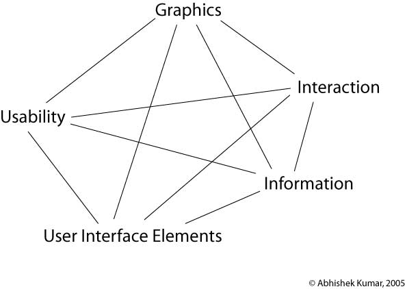
Adding to my earlier thought on User Experience…lets try getting some understanding on User Experience…
Why do we enjoy a good ‘food’??? becoz it has a perfect blend of spices and ingredients. A good cook will tell you that it’s all out ‘just perfect’ mix of ingredients…so its all about knowing and realizing this perfect mix of things for GOOD USER EXPERIENCE in products…
The ingredients involve…
- Usability
- Graphic
- Interaction
- Information
- UI Elements
So as a cook (designer) your main aim is to mix them together to make a good dish (product) out of them…skipping one or not mixing one in proper proportions would spoil the taste (experience).

So a good UI would have a good composition…where neither of the above factors dominate but work in harmony with each other…
The graphics should not dominate the information, the UI elements should compliment interaction, the graphic changes with change in UI elements or Interaction, and usability results can changes with change in any of the parameters…so it’s all connected and it’s all a SYSTEM…
Confused state of mind
Aaaah, free time again…and time to post some ideas…
I just gave an interview and to my horror I was asked…’what I want to be??’....the most difficult question to answer…what can I be??
- A Usability Expert
- An Information Architect
- A User Interface Designer
- A Graphic Designer
- An Interaction Designer
- A User Experience Designer
It’s such a tricky question…either I don’t know the exact meaning or the whole world is confused about it…becoz I never got a clear definition of any of them…
So I though of defining it for myself…
Usability: I believe it’s a field which tries to identify problems in using a product. Also it covers the testing and user research areas.
Information Architecture: Information Architecture is a sub set of Information Design…and what it does is that it tries to simplify and present the information (or commands) in a more understandable and easily perceivable way to the user.
User Interface Designer: UI design basically concentrates on UI elements, their placement on the screen and the composition of the screen.
Graphic Designer: Graphic designer is concerned for the look and feel of the UI. The color schemes ad the icons.
Interaction Designer: Interaction Designer basically handles the interaction of the product. To be an interaction designer one need to have some basic understanding of Graphics, Usability and Information design.
User Experience Designer: User experience designer should come on top of every one. When we talk to ‘experience’, then we should understand that EXPERIENCE come when you have a perfect blend of all elements Graphics, Usability and Information Design. To generate an experience the product should be usable, should be good looking, should have interesting interactions to generate the WOOW effect and should be good in information design (again to make the product easy to use and to find information).
Any one reading this post is welcome to post comments…
I am waiting for some one who can clarify my doubts about these TERMS….
Monday, October 17, 2005
What you 'Get' is what you 'See'…
There has been an interesting posting on Ok-Cancel…about the “end of WYSIWYG (what you see is what you get)??”…also you will find ‘Usability Gurus’ talking about this amazing idea used in ‘Outlook 12’...
“Ok…so?? This is same as ‘Previews’ we used to see…” so what the whole fuss about??? I have been using softwares like ‘Photoshop CS’ and ‘3D Studio Max’ and I’m not excited about this ‘WYGIWYS’ (what you get is what you see) because these software are doing this for quite some time…
The question is how far can this paradigm go…its easy to show commands like “Bold”, “italics” or (filters as in Photoshop)…what about “Save”, how about “Send Message”, how about “Inserting an Image”…command like “Break”…how to show a process??? It can show the end result??? How to use it when VISUALLY nothing changes – Export, Save, Print, Zoom…how will we show DELETE in preview??? So can we say WYSIWYG is OUT???? I don’t think so…
But a mix of BOTH…well I must admit…‘very interesting’… TO put it metaphorically design is like a game of ‘Quake’…there are lots of ‘guns’…where every gun has its own specialty…so when an enemy comes…one has to decide what gun is effective to tackle that enemy…it’s the same in UI…every design issue has a gun…you have to decide the right gun and shoot the problem…but saying a ‘Rocket launcher’ is better than a ‘Shot gun’ is not fair…as both solve different issues… :)
To add the great “Ribbon” tool bar…why can I have commands on my work space??? Why do I have to go on top header to click a tool…why can’t I have the tool bar a Right Click (right next to the place in am typing or working???)
You may find my ideas foolish or childish….but that’s ok… :)
Have a good day…
Wednesday, October 12, 2005
CTZ news for Citizen Journalists
It seems that the field of technology is moving with the speed of light. When you get a GREAT idea and you ‘think’ it’s ahead of its time…and sudden you read some article on the same subject…and then you keep thinking…IS THE WORLD MOVING FAST or I’M TOO SLOW…
I am working on a project for the past one month on building a comprehensive system to support Citizen Journalism and Freelance Journalism… its more or less complete now… during all those one month, I kept telling my self ‘woow this should be ahead of its time…’
But then I read this News on BBC... (http://news.bbc.co.uk/2/hi/technology/4330690.stm)
...and I thought…oh my GOD…my idea won’t be new for a very long…
Before my so called ‘new idea’ gets OLD…I decided to publish it on my blog…so that I can sleep in peace…believing that it was ‘NEW’…though my project goes beyond what is mentioned in the article…but it’s no doubt a step towards my concept.
So here are some extracts from the Report of that project
Abhishek Kumar,
National
Ahmedabad,
With the evolution of web and mobile technology, citizens have now tremendous power to speak out their view points and be heard. The
It tries to holistically conceptualize a sustaining system which can assist people not only to access the News but also allows people to post articles in all forms and also provides them with facility to sell those articles. It uses newly evolving Information Architecture paradigms of tagging or popularly known as folksonomy. Folksonomy is an excellent tool for reference purpose; but in this project it is also used for controlling and to create a browsing experience. As the content of the pages would be dynamically (that too with very less control on content) changing the tagging becomes very important controlling factor. Also as the ‘NEWS’ is primarily a browsing experience it tries to build up a system which supports ‘browsing’ than search. The project is built up along with a business process which would support such sites, because such project would be difficult to sustain without a proper support.
© Abhishek Kumar, 2005
Thanks
c ya
bye
Tuesday, October 11, 2005
New Method for Info Graphics...
While working on an assignment on Data Visualization, we (me, Raina and Medha) came up with a Charles Minardish Graph for a Financial Data which show the flow of money in and out of an organization. You can see the assignment on Raina’s Blog.
It was just an overnight assignment and got finished the next day. But some how this idea of representing the financial data in a FLOW got stuck up in my head. The idea of representing the ‘INs’ (earning) and ‘OUTs’ (spending) in business seemed really sensible.
So I yesterday explored some ideas and came up with a design which can represent the ins, the outs and also the flow…in a holistic way.
I call it ‘Bar-fin charts’ for ‘Bar chart with fins or Bar chart for finance’ ;)
Components:
1) x-axis
2) y-axis
3) block – the rectangular block
4) fins – The arrows that represent Ins and Outs…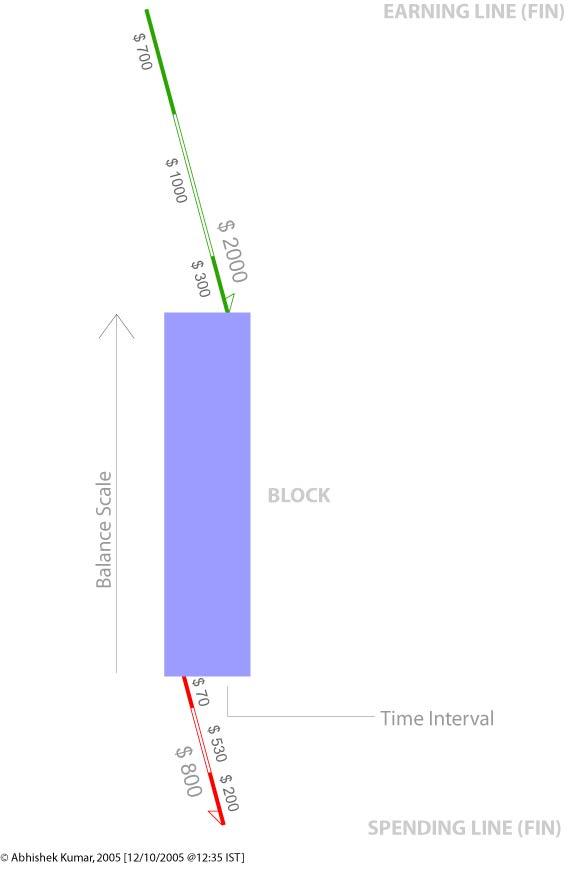
The Dimensions of data that can be represented:
1) Time Interval
2) Total Balance
3) Total Spending
4) Components of Total Spending
5) Total Earning
6) Components of Total Earning
7) Making of financial thresholds.
2) Total Balance
3) Total Spending
4) Components of Total Spending
5) Total Earning
6) Components of Total Earning
7) Making of financial thresholds.
Time Interval
The time interval is represented by the x-axis of the Block. The financial information is chunked into time intervals (monthly; weekly, quarterly, annually, etc.) so that it becomes easier to notice the comparison.
Total Balance
Total balance is represented by the y-axis of the Block. The division has to be decided based on data.
Total Spending
Total Spending is marked by the LINE (fins) on the lower side and marked by Red color. The line is tilted to 15 degrees from vertical with an Arrow marking to show that amount is being removed from the block. The length of the line marks the value of total spending. The scale of the line should match with the scale by the y-axis of the block. The side which has the arrow will label the Total Spending.
Component of Total Spending
The component is represented by the breakage or makings on Total Spending Line (fin). The values would be marked by the length of the line.
Total Earning
Total Earning is market by the LINE (fin) on the upper side of the block and marked in Green color. The line is tilted to 15 degrees from vertical with an Arrow marking to show that amount is being added to the block. The length of the line marks the value of total spending. The scale of the line should match with the scale by the y-axis of the block. The side which has the arrow will label the Total Earning.
Component of Total Earnings
The component is represented by the breakage or makings on Total Earnings’ Line (fin). The values would be marked by the length of the line.
Making of financial thresholds
In order to make the graph more readable color in the Block can be used to mark the levels in finance. Like – Dark blue for above $300, Blue for $300 to $200, Light Blue for below $200. Grey scales of a color can used to make this parameter.
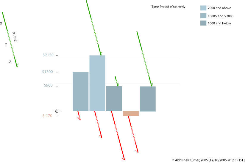
If any of you...ever use this graph...please do let me know...thanks
Gud Day :)
Sunday, October 09, 2005
Understanding Infographics
I was attending a Workshop on Information Graphics. While I was watching some path braking Info graphics I was...wondering what makes them so great...
Let see some great examples here...these graphics didn't just represented data but helped in understanding a problem...the representation lead to a solution which would have been impossible to achieve without them...
I kept thinking what is it which made them so powerful....
Let see some great examples here...these graphics didn't just represented data but helped in understanding a problem...the representation lead to a solution which would have been impossible to achieve without them...
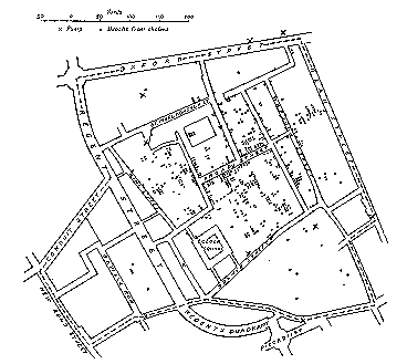
This graphic maps the Epidemic data on a Location Map. The map marks the location of patients in London. This graph leads Dr. Snow to pin point the source of the epidemic – a Water Pump on
I kept thinking what is it which made them so powerful....
The Golden Question
How could they solve a complex problem of data structuring??? What I mean to say is that there are so many ways of arranging the same data for example…Dr Snow could have arranged the same data as per DATE, or by AGE or may be by Demographics or by Financial Status of patients…which would not have let him to the conclusion which he was looking for…
Just because he chose the ‘Locational’ facet of the data that he could arrive at the ‘result’. It could be a matter of debate as to whether he accidentally took this facet or he thought about it. But for now lets leave alone this for historians to figure out…
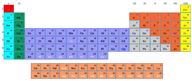
Let’s take the other example…of periodic table…had Mendelev taken some other facet of the data…he wouldn’t have arrived to such a perfect solution…though it may be unfaire to say it was accidental…but still getting the right facet to organize a data made the this thing a ‘HIT’…
So the conclusion is that for making an information graphics it’s VERY IMPORTANT to choose the right facet or axis to organize the data which eventually could give the PERFECT RESULT…
http://www.math.yorku.ca/SCS/Gallery/
Have a Nice Day…
Saturday, October 08, 2005
Thoughts on 'Customization'
While working for a project during my internship I came across this difficult aspect of softwares...called the 'Customizability'...
So when we allow users to customize the UI...then...the design moves in difficult waters...'How to control the UI consistency?' ; nobody asks the user 'How much customization you need?' or 'Are you not lost in customizing the UI?' or the golden question 'Is it making your life simple???'
Some thoughts on customization...
The major problem in customization is that the designer looses control over UI. But still it’s a designers responsibility to ensure that user do not make their page un-user-friendly. Again just because it is customizable does not mean that the product (default design) should be badly designed. The default design should be a benchmark for user in usability readability and design. They should customize their page with reference from the default design.
Cultural Models & Interaction Design
For my 'Cross Cultural Study' we had to analyse the Web sites for different cultures...the approach I took was to use the existing cultural model...the idea behind it was to get some patterns...which can be applied to other sites and thus in short building a kind of a formula which can be used in 'designing' for other cultures...here are some of extracts from the Report of that assignment...
Discussion
Hosftede model is good to give a broad perspective of what a culture is. The important point to
note here is that the parameters given by Hofstede are all relative values. So it is not correct to state that certain culture is “Feminine” or Power Driven. What Hofstede model states that one culture is more or less “Feminine” or what the case may be, than the other culture. One can broadly understand one culture with respect to the other. In my opinion that is the strength of that model.
When it comes to details of analysis, expectation or prediction; this model alone does not work.
And I don’t think this model was developed for that purpose. To do an analysis one has to experience the culture or the context to understand the people’s behavior and their liking or disliking. The situation becomes complicated when we try to analyze any artifact or a cultural opinion. The outcome of any artifact or opinion is simultaneously effected by all the 5 factors plus their oppositions- Power Distance, Individualism, Collectivism, Masculinity, Femininity, Uncertainty Avoidance, Long Term Orientation and Short Term Orientation. At it is still unpredictable as to what factor dominate and shape up the artifact or the opinion. Again one should not undermine the importance of Context in which that artifact or opinion is built.
After hours of trying to get a pattern or being able to use the Hofstede’s model unsuccessfully for
analysis of websites I have reached to a conclusion that his model can not be directly applied for analysis. With study of Halls and Hofstede’s model I came to a conclusion that these models can be clubbed and modified in order to make a model that can to an extent work in analyzing websites. This little formula is based on very few data and can be challenged. This formula seems to be working in my context and has been formulated after studying few patterns in the display of the page and information. This formula is based on the findings that High/Low Context, IDV, MAS, UAI and Religious Orientation can be primarily being identified as the influencing factors in a website...
this work is just a begining...to finally come to a concrete solution...i requires a lot of deep study and anlysis...but I was happy becoz this formula was working to some extent...
God bless you :)
p-Podcast for 'Picture Podcast'
While working on one of my assignment (a system for a Citizen Journalism), I stumbled upon an idea… ‘Why can’t there be a picture podcast?’ a mix of still images changing over an audio…
As you might have read about the latest rumors about Apple launching a video-iPodcast…
(money.cnn.com/2005/10/05/technology/personaltech/apple.reut/index.htm)
... this picture podcast idea is pretty simple in a way…it’s composition of audio + still images…which change over time based on audio…and this roll over can be automatic or the user uploading this podcast can customize the time of roll over of every image...
The advantage here would that we don’t have to upload and download a video (which has a much larger file size) but upload images which are ‘time tagged’…so an audio is uploaded in audio format but images are uploaded with an addition on time tags…
While downloading images and audio are downloaded; and at the client side these are combined together to make up an Audio-Video file…which can run on windows or real players…
While playing the images rollover based on the time tags embedded along with the audio…so people will get a multimedia experience...i guess it would be interesting...
Good Day... :)
As you might have read about the latest rumors about Apple launching a video-iPodcast…
(money.cnn.com/2005/10/05/technology/personaltech/apple.reut/index.htm)
... this picture podcast idea is pretty simple in a way…it’s composition of audio + still images…which change over time based on audio…and this roll over can be automatic or the user uploading this podcast can customize the time of roll over of every image...
The advantage here would that we don’t have to upload and download a video (which has a much larger file size) but upload images which are ‘time tagged’…so an audio is uploaded in audio format but images are uploaded with an addition on time tags…
While downloading images and audio are downloaded; and at the client side these are combined together to make up an Audio-Video file…which can run on windows or real players…
While playing the images rollover based on the time tags embedded along with the audio…so people will get a multimedia experience...i guess it would be interesting...
Imagine getting audio and images together for an event…may be like ‘
Good Day... :)
Friday, October 07, 2005
Introduction to Design
Hmmm…such ‘Information Rich’ title… “Introduction to Design”
“Introduction to Design” as in ‘Introducing…iPOD’
“Introduction to Design” as in “
What I meant was the latter… ‘Introduction’ to ‘Design’…
Are you wondering what is ‘Information Rich’…well by ‘Information Theory by Shanon’…A statement which has ambiguity is information rich…means it may have multiple interpretations…hence Information Rich.With all due respect to design gurus I’m unnecessarily trying to redefine DESIGN.
Design is not about drawing skills, graphics, color, interesting forms or aesthetics. It a was of life and way of looking at things…its as close to logic and reasoning as it is to aesthetics and a pleasing experience…
DESIGN not only integrates elements needed to achieve a solution to a problem but also creates an ‘interface’ with its Human Consumers/Users…
And its success lies in its capacity to both solving a problem and the solution be correctly understood by users/consumers (and create need, interest or a lasting impression to survive)…and that is ‘CREATIVITY or INNOVATION’ in Design…
HOW to start a BLOG???? some one please give some ideas...
When the whole world seems to be writing about their lives. I thought “Why should I be left alone?”
Why do I call my blog “THE DESIGN AGE”…you would be surprised to know that I’m a student of ‘Design’ in a ‘Design Institute’…so…‘Design Age’ makes sense…does it?
Subscribe to:
Posts (Atom)