Monday, December 18, 2006

Conquering the Interactive Map: notes from my dairy

Creating properties like Google Maps, Yahoo Maps or MSN Maps is quite a challenge. I’ll take you through the various issues that are involved in designing such properties. Lot of people seems to be now a days interested in such products; so I thought I’ll write about some design issues that one needs to understand and solve. These are from my working dairy/notebook.


Objective & Approach

The most basic thing to start the design is to be VERY sure of what the purpose of Maps. Next comes the audience as this defines the kind of approach you can take in building the UI – communication.

Communication elements - building the UI Layout to connect the Map with the information and Search elements.

  • This is the most important connection as these three basic elements combine together to make sense to the user. How one compliment the other is critical. Just for your thoughts – “how do you connect the search box with search results? – Proximity? Think about the current Layouts being used “any chances of improvement?”
  • How one places the elements helps the user connect the information that appears on the screen. Information Placement and Visual design could easily help you to establish the connection of the information on the page.


Designing and defining the Map – sequential information: connect the zoom but still be uncluttered.

  • The most critical part of the Map based products are the Map itself. One very basic difference between a printed and the interactive web map is the ‘zoom’. Zoom adds simplicity to the user but significantly adds complexity for the designer.
  • Design the Maps involves a lot of ground works in terms of what is or can be shown to at various zooms. There is practically no mathematical trick that can define what information will come at each zoom level. All this has to be hard coded with a thorough understanding of the local geography and popularity of places.
    • Golden rules –
      • What is popular should be available at higher zoom
      • There should not be clutter in the page; thus proximity of places is an important aspect.
      • Area with higher population should be on available at higher zoom
      • Area with higher area should be at higher zoom.

  • Skelton (the Data) and Visual (the skin) : Map deals with primarily two aspect one is the data – should the National Highway be shown at Zoom 10 or 11 etc? The other aspect is how to show the National Highways (what color? what font? etc). They both are side of the same Coin. They TOGETHER allow you to keep your map in FOCUS. What I mean is that with data and visuals you can play around with what information you what to highlight at what zoom level. Also the visual can help you creating the ‘sense of zooming in or out”.

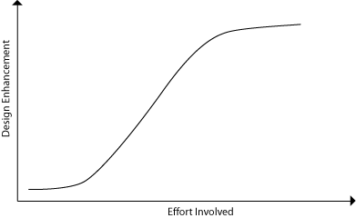
  • Effect of Zoom without information overload: The most complex part is that each zoom level should have a connection with the next higher and lower zoom; it should appear to the user that he is zooming in; at the same time each zoom level should not clutter the map with too much information. I can tell you there is no short cut to getting this right it’s PURELY iterative; but if you are smart you can reduce the levels of iteration significantly.
    • Golden rule – define a purpose for every zoom – what have you established in the previous zoom what you want to establish in this level.

Elephant don’t fit in a Rat’s pit

Maps can not solve every problem. The biggest problem is the space that is available. One might argue that this can be increased; yes but it can make the product complex. This might kill the whole purpose of Maps and also the simplicity. Treat Maps as a gateway to finding information- this does not mean that every information has to be provided in the Map itself ;)

There is lot to write…but you have to wait.

Sunday, December 17, 2006

Output versus effort trend: When to stop design

I have been involved in two products and both have been pretty extensive in terms of design. One of the important things I have been noticing about the way it is shaping up is the way I have been working. The trend is that at a point the enhancement or improvement in the design ceases to slow down and the effort involved in bringing those enhancements is much more.

What happens is that in the initial phases the output to effort is less as most of the effort goes in getting a hang on the problem. Once the problem is somewhat understood the output shoots up. That’s because the designer understands what are issues or problems that need to be addresses. As the progress goes on there reaches a point when all the problems at a basic level is fixed. Now it’s the turn for enhancement or small improvements. At this level the output that comes is much less that the input required as this deals more at a detail level.

That’s the critical moment; if you ask me there is no end to improvement - it can go for ages. But as a professional we have to decide what is “just good enough”. At a certain level it becomes very difficult for an untrained eye to find a difference between enhancements. So why do we need such an effort which can not be noticed by our user. Now the “golden question” here is WHEN TO STOP. That’s a critical question. A bad decision on this can lead to a poorly finished product. While if you don't stop at a point the product enhancement may not be so much while you might be wasting a significant about of energy and resources. This may sound trivial, but is also one of the critical design decisions – one that can make the difference between a good and a bad product.

Sunday, November 26, 2006

Why should I break my design???

I have been repeatedly asked not to provide or think about visual designs for the Products that I’m handling and follow the process. These processes break the design into multiple steps as if it’s a manufacturing unit – like an assembly line. I’ll fix one screw; the next person one will fix the other one without knowing why I fixed the first one.

Design is a complete thing. It’s a complete solution to a problem. I don’t think one can segregate it in a process. Working in a team which works together to solve a problem is a different thing; but I don’t understand how can someone who hasn’t worked on the problem before can jump midway and design a solution; without know the whole problem.

Visual design is a critical aspect. On one hand it adds visual pleasure to the page ‘simultaneously’ is also dictates the presentation of the information on the page. One bad visual balance can totally screw up the objective of the page – communication. These are so intricately woven that I don’t think it can be segregated. One needs to understand the importance of visual design – it’s just not about experience. Its power is much beyond it…one should not think about interactions, information and visual separately. They all come together to make sense…

Understanding design decisions: Testing begins where the Logic ends…

One the most complex part of design is its subjectivity. For every step or parameter there lies multiple solutions. Starting from the deciding essential features to layout to the last pixel there lies so many options that it becomes really complicated. Every step calls for a design decision and these decisions are the one that decide the outcome of a design. I often used the term ‘parameters’; what I mean by these parameters is the list of priorities that a designer builds while designing the product and which directly influences the design decisions s/he take. If the product objective says that the product has to be easy to use then the kind of priorities that will be built will be different for the objective that says the product is meant to give a nice experience.

One of the biggest problems that I have seen is that most designers loose their objective while designing. It’s so easy to get lost in making design decision and sway from the path because of the multiple solutions available to him. Designing is not only about exploring and coming up with ideas. Its also about managing your design – you have to manage your self to stay on track. All good designer that I have seen or read about were very clear till the end what they where trying to do.


Coming back to my discussion on the design decisions – there are decisions that can be taken by using Logic. From a communication point of view we can take some decisions – will this make sense to user? Will he understand the context? What is it that will tell him that this button will take him to another page? What will make him click? Etc etc…

But even after using the most refined logic (which has to be aligned to the logic that the user will use in understanding the page) you will often come up with 2-3 solutions. Every solution will have some advantages and disadvantages. That’s the most critical moment; if you keep using logic you will land up going round and round with decisions without any result. That’s the moment when you have to go to the user to test your assumptions and take the right decisions. Logic alone ‘can not’ complete a design; one has to go to the user to refine and complete it…in an architectural term I guess we can say that logic is the core foundation while testing is the upper superstructure. Foundation dictates how the superstructure will shape up - Sometimes the superstructure also refines and defines the foundation. But essentially the foundation has to be strong for the building to stand the test of time.

Looking at Google product this can be clearly seen. Their designs are smart because their Logic is solid; and to make it stronger they heavily rely on testing.

So if you are stuck up in design take the refuge with the user…he’s the one who can bail you out… :)

Sunday, November 12, 2006

Passing on ‘Passion’ to the team

I’m the product owner of user experience designs for 2 upcoming products for Y! India. How we work here is that mostly the interaction designer owns a product (equivalent to UI Lead). The ID works closely with the Product Manager to build the concepts, features (from user point of view) and UI wireframes. This is then passed on the Visual Designers for the visual design part.

I have been owning 2 products & have to constantly pass on visual design aspects to the visual designers. This is very critical aspects of design. People who have worked in a team would realize how difficult it is to pass on the ‘information’.

One thing that I have figured out is that if you don’t just pass on the information but pass it along with your PASSION and COMMITMENT there is a drastic improvement in designs from the team. Showing your passion and commitment for your product really motivates the team to put their passion to the designs. Design is not about ‘data’ and ‘observation’ alone it’s also about ‘emotions’. If the designer himself is not excited and passionate about the designs how will the users be?

Friday, September 15, 2006

Task based to Communication based approach

We have all been trained to design for Task. Most UI books talk about Task analysis and Task based designs. This might be useful for enterprise software or admin tool software. But at any or every level there is a communication that is happening. Why not look at the UI design from Communication point of view rather that from the view of tasks.

Communication approach will break a problem based on what is to be communicated and what needs to be established before moving on. For products like Yahoo! I guess this methodology is very useful. The product should be broken down into step of information. How should be communicate with the user? This is to be broken down into logical steps – like;

Step 1 : establish the purpose of the product.
Step 2 : what can a user do with it
Step 3 : What is the extent of information that is available to him.
Step 4 : How all can a user access it
And so on…

Once the communication is established then comes the tasks, operations and screens. This communication then has to be distributed into screen. One screen can be enough for all communication or it be distributed into steps based on the needs. To be on track it’s good to define an objective to every screen so that you know what is to be achieved in terms of communication (what has been established and what should come next).

There may not be anything new. Most of the people have already said all these things. This is all common sense; Isn’t it? But if you are a designer ask yourself how much you understand design and how much of it do you actually follow.

Sunday, September 03, 2006

Can Creativity be illogical?

I was recently sent by Yahoo! to attend the stakeholders meeting for structuring a new course for National Institute of Design. All the bigwigs were present there from the industry. Some one in the open session made a statement that “…engineers are less creative because they are more logical...”. This implies that designers are creative because they don’t think logically. I have strong disagreement with this myth. How can something which is USEFUL & USABLE be illogical?

Creativity is an out come of knowledge. It’s a different ‘point of view’ of looking at problems. But we can’t call it illogical. To make sense the users uses ‘logic’. The logic of the ‘design’ should be in line with that of the user. If both logics don’t match the communicability of design is compromised. So the design is built on logic but what solution that it presents can create a ‘surprise’ in user. Presenting a solution which doesn’t use a ‘Standard and Expected’ logic is what we know as ‘creative solution’. Creative solution can be ‘consistently’ created by one’s ability to understand users, by using some logic which creates a surprise and accurately solving a problem. But definitely creativity in design is not illogical. Every element (or pixel) has a reason to be there – either for communication or experience.

On the contrary ‘ART’ can be illogical because art is about ‘expression’ and ‘feeling’ more than communication. Expression itself is communication in Art but not in design; because design is meant for others unlike art.

Another point that I would like to mention is that there was a lot of emphasis to add “Design Processes” to the course. It seems that there is mindset which thinks that creativity comes by following a Process. Does following UCD ensure a creative solution?? Creative solution comes from individuals or a groups’ understanding (of problems, user, business etc… broadly ‘the complete environment’) and their ability ‘explore’ different points of views.

Creativity comes from knowledge (about user, problem, art, drama,….any thing and everything under the sun or beyond). Design uses logic of anything that can be used and understood (by others) to make sense to others. It’s convergence. It’s the highest forms of logic; but logic ‘without boundaries’. Not only can Design use existing logic but also can ‘create’ new ones by convergence.

Creativity doesn’t come from an alien planet its here amongst us – one just needs to see it. Creative people have an eye to see it unlike the rest who ignore it.

Tuesday, August 22, 2006

Concluding...(Design- Part 1)

My last articles (Moving from Needs to Problems & Design: Simultaneous Processing) had some interesting comments from friends. Most of the time I have been told to break the design to disciplines and processes. But that’s totally contradicts to what I’m saying. These disciplines have been existing for sometime now and most of you “might” agree that though they have been able to make a ‘workable’ solution any ‘innovation’ hasn’t happened from it. Innovations don’t happen by Process or Methodology or by distributing design; it happens by understanding problems and convergence.

These Processes have been there for sometime now I’m also aware of it (to make myself clear). For implementation, Process or Methodology 'is' needed; even I’m a firm believer in that (In Praise of Methodology). What I have been recently writing is about ‘approach’ or ‘attitude’ to design. Most of us at the first instance want to break the ‘Design’ into processes. The whole point is not to break the ‘Design’ but break the ‘Problem’ (why is the design needed? What is the problem it is going to solve?). Any big enterprise/complicated UI Design can be broken into smaller but ‘related’ problems. What we design should take into account all the parameters that influences or shapes up the design. The more knowledge we have about them the better design we can make. The best approach is to think of ALL the parameters that affect a design and if it becomes unmanageable then start Priorities them and then remove. Removing it consciously is a better approach than skipping it altogether.

Afert the understanding is developed on the problem, break the design solving into ‘Processes’. Processed don’t give solutions they just keeps you on track. Breaking the design in Disciplines comes at the ‘implementation level’ - once you know 'what to solve'. It’s the last leg of DESIGN.

What I have been advocating is to THINK and ANALYSE before starting to ‘sketch’/ ‘draw’ / ‘solve’ (I won’t say Design because its the analysis phase that shapes up the end product; its as much design as the rest of it). What I’m saying is not fundamentally different from what other Design Gurus have said. My approach to solving design is to understand the very core of WHY? WHAT? and then to HOW? And to look at the Problem ‘holistically’ first than fragmenting design into steps and disciplines. I hope this ‘CAN’ help me innovate or look at designs a little differently (hopefully rightly).

I do accept the fact that I may be wrong...but what the harm in trying. Failing is another form of learning...

Friday, August 18, 2006

Moving from finding NEEDS to PROBLEMS

I recently went to see a presentation. The presentation was about an overview of a Research Group of a company. The presenter stated an interesting point “…look for NEEDS and design for it”.

This is quite interesting. I’ll just take a philosophical route (if you want to say its philosophy) and talk about NEEDS and PROBLEMS. We designers are “generally” trained to design for “needs” and researcher are trained t solve “problems”. How these words change the approach is interesting.

There will be people who will argue that NEED may not be existing and an introduction of a new gadget might create it – say like – iPOD or SMS in mobiles or Miss Calls or Mobile phones itself so on and so forth. When we look for need we bias our self to a solution; when you look for ‘need’ you have an idea about the solution. Let’s say to argue – “There is a need for a gadget that could allow people to listen to music while they are mobile”. We already have defined the need; so at psychological term we jump to finding solutions.

What PROBLEM does it; it opens up the issue for investigation. Lets say “People get bored while they are mobile for a long time”. The problem may have multiple solutions. The statement asks to investigate deeper into the problem. This means that the designer would have more scope to understand the problem thus may come up with a more appropriate design solution (or even multiple solutions) to the problem. To be better designers the approach should be…to look for PROBLEMS than NEEDS.

Though one may argue and say that both are just a play of words. It may be a play of word but they definitely change the approach and attitude towards design. The “problem statement” defines the route you would take to solve it…

The design doesn’t start at the drawing board but it ends at the drawing board. It had started with the time the designer was (actually) born. Because what he understands about people, their needs, his observation of the behavior or environment, his experience of handling the previous projects etc is all that basic data that he will use to design it. The more rich it is the better design can one make.

So if you are observant and can see the problems from you day to day life (or related to your) the better designer you can be. So pick out problems and keep your database building – you never know what may come handy in your next project. If you are a designer – you works 24x7; this world if your Labs (the best you can ever have).

Friday, August 11, 2006

Beyond Observation...

In my earlier blog “ BIG IDEAS come from small thing around us…” I had written about need and importance of observation. Continuing on that I want to add few more aspects to it. No doubt that the eye for observation is needed; but there is a need to go beyond and understand the reasons for that behaviors/situation. Observation is just the introduction of a problem; its analysis is the thing that leads to solution…

I saw a demo of an experiment by taking the Table Desktop as an example BumpTop 3D Desktop Prototype . They observed how people manage their Desktop and tried to come up with a software that replicates it. Now the question here are 2 – why replicate the real life into another medium (Learnings from History of Architecture ) and secondly it does not try to understand why do people manage their work like that.

This to my understanding its just an observation. We need to understand why people do that. This is not the problem; it’s an outcome of some need/problem. If we know what is it that people want we might be able to solve it for the ‘Screen Interface’ (a different medium) and hopefully the solution would be very different from the one tried here.

(Say) People generally don’t go shopping alone. This is an observation; but the reason why people this way may be that they want someone to assure or help them in decision making…or it may be a psychological need…If we know the reason the solution we try to achieve would me more appropriate…

I’m not sure if I’m able to express clearly here…hope you understood :)

Friday, August 04, 2006

Design - Simultaneous Processing

Though the title might look technical the subject I want to talk is not. Though what I write may be a bizarrely philosophical; that it means may not be so absurd. They are all a reflections of my thinking both about UIs and Design in general. Design - I’m sure you will agree - is a continuous learning. Every project/product thrown up different challenges; so every new project is built on the experience and learning of the previous one. So one should keep their ears, eyes and more important the mindopen to learning. Writing is my way of learning.

Let’s come to the point. Why do I say ‘Design as Simultaneous Process’?? any thoughts?

Taking UI Design as an example; lets try to see what builds it – there are two primary aspects Communication and Experience. The main aim of UI is to help human operator to communicate with the machine; but at the same time this communication should be interesting and engaging for the human operator. This helps him in doing his work efficiently and effectively. Now the big challenge is both communication and experience should be in sync. What do I mean? What I mean is if either of the two are lacking in their role; the over all communication and experience is not achieved. Which means a FAILURE OF DESIGN. So as a designer one needs to do parallel or simultaneous processing – taking care that 'both' not only individually are efficient but when they combine together also create a greater impact. Communication is supported by experience and vice versa. Which one will dominate or if they be equal will depend on the ‘Context of usage’ of the application. If design is good in experience but bad in communication it fails and vice versa

Its here that my earlier thought about Research and Design fits in; communication is one which is driven more by research while experience is what is more driven by creativity. Now you would ask where will I place Interaction design or Visual design or even elements like navigation etc; what category are they – Communication or Experience? Well; they lie in both; every element has both communication value and experience value.

Isn’t it complex? Yes it is. That’s where the knowledge of a designer comes into picture. The more and more parameters a designer can process the better and more complete design he can make. If I can think of 1000 parameters at one time; means that I am taking all those 1000 criteria for designing and that I’m designing for those 1000 parameters. This should ensure that the design has taken care of those 1000 criteria. These criteras are nothing by parameters; mentions in my earlier post.

Pheew. That’s why I call it Simultaneous Processing.

Looking at in a very detailed level – the UIs is a set of elements. Not only do the individual elements have to be good but when they combine with other elements in the UI - the whole UI also should look good. Same is the case with products – if the packaging is not good; even if the item inside is good; people wont like to buy it; is the packaging is good but the item is not good them; they might buy it once; but they wont buy it later.

Thus design is complete system; to work effectively it has to take care of each and every element – Simultaneous Processing.

There are Processes which break all this into disciplines - Interaction, Visual etc. But what I talk is not UCD Process but an 'Approach' to design. Approach should be to design for all the parameters available rather that dividing it into sub part. No doubt with division we can make the design process simpler; but it compromises the completeness. Individual design disciplines can care for their own part but even in UCD Process there could be people who should think about the connections - the over all design.

Thursday, August 03, 2006

Design Portfolio

My old NID portfolio now goes online. You can see it by clicking on this link PORTFOLIO.

Wednesday, August 02, 2006

Academic - Research & Reports

Now that i have completed my Post Graduation from National Institute of Design; I'm sharing my Academic works with others. All these works were done in NID and were done solely my me.

Research
User Testing of Adobe InDesign CS: using a Cognitive Walkthrough approach
by Abhishek Kumar;
Course : 'Cognitive Ergonomics'

Comparitive study of cultural impact on websites: A case study on banking websites of Saudi Arabia and United States of America; Government websites of France and Germany
by Abhishek Kumar;
Course : 'Cross Cultural Studies'


Usability
Task analysis of 'Meeting Request feature of Outlook Express
by Abhishek Kumar

Usability Evaluation of My Yahoo!
by Abhishek Kumar


Project Reports
La planete de memoirs
by Abhishek Kumar

CTZ : Citizen News

by Abhishek Kumar

Patterns in Data Visualization*
by Abhishek Kumar, Awinash Raj, Kumara Manikandan, Medha Yadav, Raina Saboo, Sonal Nigam

Systems Design: Office Management System for Architects
by Abhishek Kumar

All these reports are available; in case some one wants to read them kindly contact me.
* it was a group project report can be published if all of the group members agree upon.

La planète de mémoires

The best part of ‘New Media’ is that…it gives you enormous power to express your self. ‘ART’ as they call is all about expressing yourself and generate ‘feelings’…or make you look at things ‘differently’…
This is my ‘small effort’ to look at things ‘just a little’ differently. This is part of my academic project…which I want to share with you… IDEA
The genesis of ‘La planète de mémoires’ came from my previous idea of exploring the possibility of projecting images on trees. The idea was to explore the possibilities of projecting images or video in a VOLUME of space rather than on a flat SCREEN. Initially the plan was to project only one projection on the foliage of a tree, but then came the question that as this is a volume space why not project multiple images and create a moving (real time) 3D collage on a volume of space. But due to some reasons the implementation could not take place. But this idea lied latent before I stuck up with another idea – ‘Why not recreate a 3D surface and in case of projection we can have backlit screen.”
This idea is just an exploration of looking at pictures in a different way - spread into 'space'. With digital cameras, we are all flooded with images. The number of images in our lives is mounting so high that we rarely take out time to see them. It display is a Globe (sphere) with small cubes all aligned together inside them. Each side displays a portion of an image so that the combination makes a substantial part of that image. But to be able to see the image one has to conciously stand in position to make sense of it. Else we only see them in parts- as collage of memories (images) in our life. With a projector on the top it also allows you to project an image on any surface…
- from my project report.


© Abhishek Kumar, 2005

Saturday, July 08, 2006

Learning from History of Architecture

Architectural history shows us some similar trends across regions and periods. Whenever there has been an introduction of a new ‘material’ in building construction; artisans and architects have tried to use them in a way they used the older materials. We humans try to impose previous knowledge on anything ‘new’ we encounter. If you look back at history lanes in architectural development you will find how much influence an old style has on anything new. When stone was introduced in construction along with wood the type of carvings done on stone was a clear reflection of the carvings done on wood before. Not even that; the kinds of shapes in wooden architecture also influenced the shapes of stone architecture buildings. Another great example we can find in Buddhist rock cut cave architecture – Not only the carvings but also the use of pillars was influenced by previous styles. As we know that rock is monolith and one doesn’t need pillars to make it stand. With only time do we understand the true potential of any new medium/material.

To some extent it has been true to even UI design. With this a new medium (UI) we tried to impose different known understandings to build our designs – metaphors, 3D environments etc. But sometime we forget the fact that we are dealing with a different medium altogether. They have their advantages but also create that much more problem for us. We need to understand that it a new medium, which has its own qualities. Rather than looking and forcible molding different medium for it we should understand the uniqueness of this medium and design for it. I know these are noble thoughts and easy to say and write but difficult to do. But the only thing I’m trying to do it to mold my attitude towards this thought. Cautioning myself to judge the need and utility of leveraging other older knowledge to suite UI design. Previous understandings of other fields do help in some situations but it should not be overdone. The attitude and approach should be to design for UI (new medium) and not to look for metaphors in architecture, fine art etc. every time.

Wednesday, July 05, 2006

The subjectivity of Design

One of the things that make “Design” so complex is its “subjectivity”. By subjectivity I mean that any given problem can have numerous solution each having some unique quality. It solely depends on the ‘design decisions’ that are made during the course of designing. Design decisions are primarily governed by its designer’s understanding of the problem, people, technology etc. That’s why any a single design problem could have multiple solutions if designed by different designers or design teams.

The ‘kind’ and the ‘amount’ of parameters (or priorities) that a designer considers while designing shapes the outcome. The more aware and sensitive a designer is about the problem the better design s/he makes. So when we say “this is a good design that takes care of even the minor details” means that the designer have built the design not only with the ‘right parameters’ but also have worked with a ‘large amount’ of parameters during designing. If the parameters or design decisions are realistic and as per users expectations there is a good possibility of it being a good design. This means that a designer should have a very rich knowledge about all the aspects of users, their interactions with the product and the technology. The more aware a designer is, the more parameters s/he can work with and thus more is the probability that the design s/he makes is useful and thus successful. One crucial skill a designer should have is a hunger to grasp knowledge though all sources – observations, reading, research etc. Another skill is the ability to see a problem with different Points of Views; thus bringing in more and more parameters to work with to build a rich design.

Possessing - Space in Time

I remember the time when I was about to leave my College - IIT Roorkee (where I did my graduation). I had cleared my ‘no dues’ and handed my ID card in the administrative office of my college. I came out and was passing from the library when suddenly realized that this place no longer belongs to me. I’ve no right to go to the library I had used for the last 5 years. I can still recall in detail how upset I was and how dejected I felt. This memory was fresh when I left my postgraduate institute (NID); so I prepared myself to accept this emotion.

I recently visited NID and I saw one of my juniors sitting quietly on the bench. The new batch has joined in and they were roaming all over the campus. I went and asked her why she was so quite. She told me a strange thing – She said that she was not able to adjust and accept that now she has to share her institute with strangers - her juniors. She was not able to accept that her institute belongs to her juniors as much as it belongs to her.

After that I came back to my home where my father had just retired after about 45 years of service – he was a Professor. I saw him sitting quietly and trying to adjust to the terms that he doesn’t have much right left in his University.

Then I sat quietly wondering how we humans start to feel emotionally attached with a SPACE. We want possess it for our lives; but we most often forget that the possession is there for a moment in TIME. That space is ours for a moment then it starts to belong to others. This relationship of time and space is quite intriguing; people return back to their old institutes/homes to re-live their gone-by era. But we forget that thought the SPACE is there but the TIME has changed. Now it’s someone else who own and possess it. That’s why when we come back to live our older moments we feel disappointed. It’s a normal human emotion and we as designer need to know it. We (designers) need to know others and ourselves a little better to make our and their life a little more pleasant. I was wondering - ‘can’ or ‘how can’ this emotions be generated for the web?

So when ever you want to re-live your moment in a ‘space’ think about the it and enjoy it in its ‘present form’…

I don’t know, but I feel that a dying man might also feel the same emotions on losing the possession of Space in Time…

Sunday, June 25, 2006

In praise of Methodology

As designers we often face with the argument about a need for a Design or Research Methodology. There are people who believe that design is intuitive and has to do with creativity; and thus a methodology would not be needed. Some would argue that they usually don’t follow any methodology and still can make a good product.

To some degree this approach (of not follwing a Methodology) to design is adequate. But the real problem arises when a designer faces a "complex problem". It’s then that a methodology comes for a rescue. Methodology can never make a person or a design creative. But what it insures is a step by step process in solving it. Breaking up the problem into smaller part with an understanding of their connections is very critical step in solving a complex problem. Design is all about trying to solve a problem taking into all the practical constraints possible. With proper constraints even the smallest of details are taken care of - and thats what makes some design stand out from other. Beause they take all built with the right constraints.

Most of the time, the design problem is not so complex. That one needs a methodology to be followed. But designers who have a good understanding of it can really take up challenging problem; I call them “Technically” strong designer, they are “Technical Designers”. It’s methodology which gives a lot of flexibility to a designer.

So if a designer says that he never follows a methodology – that’s because either he doesn’t know one or s/he doesn’t understands it.

Tuesday, May 16, 2006

Beaten by Google...

Google came up with Notebook. My Hack Day product concept was very close to this idea. I was beaten by Google. The idea itself is not so unique; but the way a product is thought make it so poweful.

Now I really respect Google. The indeed are innovative and people there definitely have a good eye for observation. Notebook requirement was already there to be recognized, they just made it before I can.

The worst part is that Notebook not only does similar things but does it in a similar fashion to my idea. So the only consolidation I have is to say...if Google with their most innovative team can come up with a product which is so close to my concept (which was done just in a day)...then I'm on the right side of the FENCE. But still my idea goes a little far than Google’s. There is still so much they can do with it...which I’m sure they will. They indeed took my glory :(

But with all respect to innovators of Google...I really take this challenge to beat Google next time. I don’t know if I'll ever accomplish it...but this is my motivation and the driver. The best way to beat them is by "thinking ahead of Time". 'Time' it seems is the most crucial aspect. I have just started my career (I'm doing my final project to complete by Masters in Design)...so I have a long way to go.


Some day...I will be ahead of time...

Monday, May 15, 2006

Unfolding the Layers…

The more and more I work on research the more feeling I get that problems have a LAYERS.

There is a ‘covering layer’…a layer which can be easily seen by most people. Problem in this layer could be found very easily. The best way to judge is to give the problem statement to others and ask them to figure out the problems. If you have not found any unique problem that the other could you are very well on the ‘covering layer’.

Behind this layer lies another layer. Let’s call it the “Middle Layer”. With very good “understanding of the problem”, “Vision”, “Intention & motivation”, “Knowledge about the topic”, “EYE for Observation” and “Very good Methodology” you can uncover the middle layer. This layer would lead to lots of other issues which the covering layer missed out. And possibly this will let you related the 'source' or 'problems' together. Most Research which get published work in this layer…

But there is more…I have never reached there but I very strongly feel there is another layer beneath the Middle Layer – the “Core”. The core should uncover the real problem; a design solution here would really solve most issues and take design to the next biggest level – “close to a perfect solution”- though ideally there can not be a 100% accurate solution in design. To uncover this I think you need wisdom, loads of experience and knowledge.

This may sound a little philosophical, its just what I feel. But this is my driving force - 'find the core'.

Thursday, May 04, 2006

Hack Day Prize

I won 2nd Prize for my Hack in Yahoo! Hack Day Competition.

The awards were given by Terry (CEO of Yahoo!) and the founder Jerry Yang.

Have alook at the Video


http://www.youtube.com/watch?v=vlZvXMgoJhA

Tuesday, May 02, 2006

Music & Design - WOOW

While being associated with Design for about 7 years now; I’m slowly getting to know a very small part of it. Recently I was going through the Larry Tesler’s presentation on ‘WOW’.


Who is Larry and what is WOW? Good question. Well Larry is currently the VP of Design at Yahoo! One of the founders of Interaction Design.

And ‘WOW’ is the feeling one gets one we see something and says “WOW” :)


Anyways reflecting on the WOWness in design yesterday. One of the most successful designs – both in my architecture and new media design – I have made (which had a ‘some’ WOW) had been made by a lot of PASSION. These are Projects in which I have given my heart out- I have ‘lived’ them.


I have been playing flute for about 10 years for now. And with what ever little experience I have of music; I know when is my music touching others heart. It’s when I’m playing through my ‘heart’. If you can’t play through your heart you will never be able to reach the heart of the audience. If I can't feel my music how will the audience?


I guess the same rule applies to Design. No matter what process you follow; if you are not Passionate about your project. You can NEVER create the WOW. Like music you have to feel it through your heart first and only then can you even ‘think’ of generating the WOW in others.


The reason why Apple iPods or Macs generates WOW is because it’s made with passion (at least I feel the WOW in them). It touches the heart and imagination because it’s made with ‘Heart’.

Sunday, April 23, 2006

Reflections on Yahoo!’s Hack Day

Yahoo! Bangalore recently had a Hack Day – A day where one can Innovate and present Ideas. It’s a competition where people have to work the whole day –make a prototype and present it in the evening.


There were amazingly 92 presentations at the end of the day. Being from a non-coding background does add some handicaps but it thankfully gives a broader spectrum for thinking. I’m saying this after watching most of the ideas done by coders/engineers.


One think that I figured out was that “Engineers design systems for themselves or for other Engineers”… “Geeks designing for Geeks”.


Though they must be very good in what they do; but they forget the basic Principle of Design – Design is for “others”.


Making a process simpler from messaging from Windows to Linux is cool. But there are bigger issues that need to be solved for common people. That’s I guess the basic difference in the Point of View of Engineers and Designers.


Engineering Education should include the aspects of design. The day Engineers change their perception about design…we designers won’t be needed.

And yes my idea also made it through the top 10 :)

Be hungry and be foolish

I wanted to write this blog for so many months. But finally I’m writing it today.


I read a very motivating speech by Steve Jobs (he indeed has lot of VISION as far as design is concern). The thing that caught my eye was a phase in his speech “Be hungry and be foolish”. Reading this and I said “…woow this is so cool…”


Why is it so important…

Firstly, some great ideas are lost because we believe they are foolish.

Secondly, you need guts to be foolish

Thirdly, no one can be intelligent all the time.

Lastly, even if you can manage to be intelligent; it’s so boring to be intelligent all the time.


The hunger to innovate or thing is FUEL that charges a person to create. When you are hungry you are willing to take risk and think out of the box. If you are satisfied you are DEAD.

Wednesday, February 22, 2006

BIG IDEAS come from small thing around us…

Some thing nice just happened…

As I had mentioned earlier…field study resulted in an interesting ‘observation’ on people's behavior which gave a small idea and which finally resulted in a BIG CHANGE in our approach to our ‘Product’ :)

There is some thing new that I realized recently…one need a good EYE to do an OBSERVATION…its very easy to loose out small subtle things which appear so obvious and are taken for granted…but these are the things that can really change the way you look at things/behaviors…

I guess that’s the most precious aspect of design…be sensitive and open…be observant… allow and accept results/ideas… KEEP THINKING….and creativity will fill you up…

Wednesday, February 08, 2006

Designing + Managing a Software Product Design

At Yahoo! I’m designing a product (something that I love doing :) ). What Yahoo! had was a new technology & what I’m doing here is that I’m using that technology to make a new product for Yahoo. This is great opportunity for me because not only that I am trained into designing products (and not only UIs) but also that I’m really passionate about ‘designing'. I have been quite lucky that I have been given full liberty and great amount of “charge” of this project.

There have been quite a number of learnings as this project is moving. What I have realized and what I’m learning is that designer needs to be good manager. As a designer what I need is to innovate, be creative and bring new ideas to the table; and as a manager I have to break up the designing process into phases, where each phase leading to some conclusion/learning and the next phase building on the learning of the previous one, constantly evaluate results, build and modify timeframes (based on conclusions from the previous phase which might sometimes be surprising - It very often happens when your tying to do something new. Where the conclusions can not be very definitively predicted.) And then to make sure the project is completed “satisfactorily” with in time frame. It’s one learning that one can not get in an academic environment and one that is very vital for a designer.

I’m not a management guru and this is not from any book. It a reflection of what I’m doing or have done. It’s sometimes good to sit back and ‘reflect’ on what you are doing or what you are learning…so here it goes… with my experience this is what one needs:

VISION – a vision to see the not only the results but also in between milestones.

ANALYSIS – to be able to break that vision into reasonable milestones and to analyze the problem statement.

FOCUS and CLEAR – it very easy to get carried away as a designer and lose track of the original problem statement. A clear focus brings a better design.

FLEXIBILTY – both to accommodate new ideas and to respond to it (by modifying the project plan to accommodate the findings). With whatever little experience I have most often a good Field Study results in some surprises to designer/user study researchers; and it’s very easy to keep a blind eye to them if we are too biased or in love with our designs. We generally tend to see thing the way we want to, things that support our assumptions and ignore the real learning.

What I have been missing out is ‘People’s Skill’. That’s because till now I had a good experience from people. I have been a little lucky. So I would include all that one I face it or get a LEARNING from it ;)

It’s an important aspect though…

Data Viz...

Infographics is very interesting area. It’s very powerful tool, which help us to present a complex data in a meaningful graphics. And guess what it’s not as simple as it looks like…

The first phase of deasig is to research on the data…what has to be conveyed??? What is the point of view??? Which relationship of the data is important for the graphics to be effective???

Now my research started with the data given to me…(it was an academic exercise)

If you look closely this data has numerous relationship between each other…
1) Comparative relationship of each data between India and China
2) Comparative relationship of data of ‘one countries’ between years 2001 to 2003
3) Comparative relationship of data across India-China between years 2001 to 2003
4) Comparative relationship of sectors…
5) Comparative relationship between ROI and ROE

Now my objective of this graphics was to bring out the above comparative data is a way such that it highlights the comparisons and thus to bring clarity.


The Design Method

To show various comparisons I used various methods:

  • The color code to differentiate between India and China (India in blue and China in Red)
  • The change in Typography to differentiate between years…
  • A light colored dotted line to guide the ‘eye’ to bring out the comparison in data across year.
  • A straight line to help in comparing the data between the two counties in the same year.
  • The gird on the back help in finding an approximate values…change in grid line color and width marks the threshold, which help in judging the values.
  • Increase in the typography and position of values to ease in perception of the grid thresholds.
  • Positioning ROE and ROI across in order to see the relative value. I came to know that the relationship of ROE and ROI may not be very relevant or important.
  • Use of graphics (icons) for sectors in order to speed up the perception.

Patterns in ‘Data Visualization’

As apart of our course in ‘Data Visualization’, we were asked to categories different Data visualization techniques. We took a little path to solving this problem…we took the challenge to solve the mystery and create a formula for ourselves…

The process started by collecting about 900 images of various examples of data visualizations. Next came and extensive session of “Brain Storming”…

Brainstorming threw quite interesting view to data visualization…things when categorized gave an interesting picture…

There are various facets to data visualization…
1. Tools
2. Methods
3. Ways of representation
4. Purpose
5. Content

Where Tools were graphical techniques primarily used to distinguish one data from the other…

Methods were various factors like choosing axis, degree of abstraction…etc…its various decision a designer takes before deciding the graphics.

Ways of representation were know “outputs” like pie chart, bar chart, illustration, maps etc…

Purpose is the purpose of making data visualization like instructional, comparison…etc

Content defines the kind of data…like quantitative, descriptive…etc

The next part was little interesting…we realized that Content Purpose and ways of representation were closely connected.

Not only that we sorted the 900 samples into a 2 way matrix to figure out how closely are they connected.

This was an early exploration of the assignment…

Hitchhikers Guide to the Earth

We generally associate places or cities based on what we hear or experience from them…and we tag them as ‘Historical’, ‘Religious’, ‘Peaceful’, ‘Beaches’, ‘Mystical’ ‘fun’ etc…

So why not have a web-based application running on GIS (like google map) where we allow people to ‘tag’ places with their terms…not only that allow them to “Refer” or post in their experiences related to that place or city. Also if we can store user’s choices we can do a ‘Tag match’ or ‘profile match’ (with other users) and throw in suggestions to the user…like as per your liking these are the places you would like…a travel planner should also be a part of the system. People can suggest places to stay or travel also…which can make the system more comprehensive…

Powered by CBIR (content based image retrieval) we can also “find/search” places based on the uploaded image ‘query by example’…with a descriptive search also I hope we can also sort our and suggest places to visit.

As far as business model is concerned there can be a huge scope for advertisements for travel agencies, hotels etc.

Tuesday, January 24, 2006

Visit my other blog

Hi...
im no longer posting on this blog...plese do visit my other blogs...especially

http://abikr03.blogspot.com/

where i post my thoughts. As I'm currently working with Yahoo! Software Development, Bangalore. I'm not posting on works and ideas...

Thanks