It was just an overnight assignment and got finished the next day. But some how this idea of representing the financial data in a FLOW got stuck up in my head. The idea of representing the ‘INs’ (earning) and ‘OUTs’ (spending) in business seemed really sensible.
So I yesterday explored some ideas and came up with a design which can represent the ins, the outs and also the flow…in a holistic way.
I call it ‘Bar-fin charts’ for ‘Bar chart with fins or Bar chart for finance’ ;)
Components:
1) x-axis
2) y-axis
3) block – the rectangular block
4) fins – The arrows that represent Ins and Outs…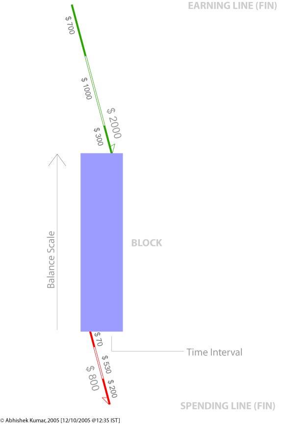
The Dimensions of data that can be represented:
2) Total Balance
3) Total Spending
4) Components of Total Spending
5) Total Earning
6) Components of Total Earning
7) Making of financial thresholds.
Time Interval
The time interval is represented by the x-axis of the Block. The financial information is chunked into time intervals (monthly; weekly, quarterly, annually, etc.) so that it becomes easier to notice the comparison.
Total Balance
Total balance is represented by the y-axis of the Block. The division has to be decided based on data.
Total Spending
Total Spending is marked by the LINE (fins) on the lower side and marked by Red color. The line is tilted to 15 degrees from vertical with an Arrow marking to show that amount is being removed from the block. The length of the line marks the value of total spending. The scale of the line should match with the scale by the y-axis of the block. The side which has the arrow will label the Total Spending.
Component of Total Spending
The component is represented by the breakage or makings on Total Spending Line (fin). The values would be marked by the length of the line.
Total Earning
Total Earning is market by the LINE (fin) on the upper side of the block and marked in Green color. The line is tilted to 15 degrees from vertical with an Arrow marking to show that amount is being added to the block. The length of the line marks the value of total spending. The scale of the line should match with the scale by the y-axis of the block. The side which has the arrow will label the Total Earning.
Component of Total Earnings
The component is represented by the breakage or makings on Total Earnings’ Line (fin). The values would be marked by the length of the line.
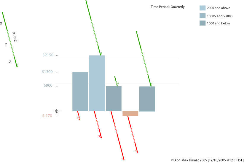
Making of financial thresholds
In order to make the graph more readable color in the Block can be used to mark the levels in finance. Like – Dark blue for above $300, Blue for $300 to $200, Light Blue for below $200. Grey scales of a color can used to make this parameter.
If any of you...ever use this graph...please do let me know...thanks
Gud Day :)
No comments:
Post a Comment