Google came up with Notebook. My Hack Day product concept was very close to this idea. I was beaten by Google. The idea itself is not so unique; but the way a product is thought make it so poweful.
Now I really respect Google. The indeed are innovative and people there definitely have a good eye for observation. Notebook requirement was already there to be recognized, they just made it before I can.
The worst part is that Notebook not only does similar things but does it in a similar fashion to my idea. So the only consolidation I have is to say...if Google with their most innovative team can come up with a product which is so close to my concept (which was done just in a day)...then I'm on the right side of the FENCE. But still my idea goes a little far than Google’s. There is still so much they can do with it...which I’m sure they will. They indeed took my glory :(
But with all respect to innovators of Google...I really take this challenge to beat Google next time. I don’t know if I'll ever accomplish it...but this is my motivation and the driver. The best way to beat them is by "thinking ahead of Time". 'Time' it seems is the most crucial aspect. I have just started my career (I'm doing my final project to complete by Masters in Design)...so I have a long way to go.
Tuesday, May 16, 2006
Beaten by Google...
Monday, May 15, 2006
Unfolding the Layers…
There is a ‘covering layer’…a layer which can be easily seen by most people. Problem in this layer could be found very easily. The best way to judge is to give the problem statement to others and ask them to figure out the problems. If you have not found any unique problem that the other could you are very well on the ‘covering layer’.
Behind this layer lies another layer. Let’s call it the “Middle Layer”. With very good “understanding of the problem”, “Vision”, “Intention & motivation”, “Knowledge about the topic”, “EYE for Observation” and “Very good Methodology” you can uncover the middle layer. This layer would lead to lots of other issues which the covering layer missed out. And possibly this will let you related the 'source' or 'problems' together. Most Research which get published work in this layer…
But there is more…I have never reached there but I very strongly feel there is another layer beneath the Middle Layer – the “Core”. The core should uncover the real problem; a design solution here would really solve most issues and take design to the next biggest level – “close to a perfect solution”- though ideally there can not be a 100% accurate solution in design. To uncover this I think you need wisdom, loads of experience and knowledge.
This may sound a little philosophical, its just what I feel. But this is my driving force - 'find the core'.
Thursday, May 04, 2006
Hack Day Prize
The awards were given by Terry (CEO of Yahoo!) and the founder Jerry Yang.
Have alook at the Video
http://www.youtube.com/watch?v=vlZvXMgoJhA
Tuesday, May 02, 2006
Music & Design - WOOW
While being associated with Design for about 7 years now; I’m slowly getting to know a very small part of it. Recently I was going through the Larry Tesler’s presentation on ‘WOW’.
Who is Larry and what is WOW? Good question. Well Larry is currently the VP of Design at Yahoo! One of the founders of Interaction Design.
And ‘WOW’ is the feeling one gets one we see something and says “WOW” :)
Anyways reflecting on the WOWness in design yesterday. One of the most successful designs – both in my architecture and new media design – I have made (which had a ‘some’ WOW) had been made by a lot of PASSION. These are Projects in which I have given my heart out- I have ‘lived’ them.
I have been playing flute for about 10 years for now. And with what ever little experience I have of music; I know when is my music touching others heart. It’s when I’m playing through my ‘heart’. If you can’t play through your heart you will never be able to reach the heart of the audience. If I can't feel my music how will the audience?
I guess the same rule applies to Design. No matter what process you follow; if you are not Passionate about your project. You can NEVER create the WOW. Like music you have to feel it through your heart first and only then can you even ‘think’ of generating the WOW in others.
The reason why Apple iPods or Macs generates WOW is because it’s made with passion (at least I feel the WOW in them). It touches the heart and imagination because it’s made with ‘Heart’.
Sunday, April 23, 2006
Reflections on Yahoo!’s Hack Day
Yahoo! Bangalore recently had a Hack Day – A day where one can Innovate and present Ideas. It’s a competition where people have to work the whole day –make a prototype and present it in the evening.
One think that I figured out was that “Engineers design systems for themselves or for other Engineers”… “Geeks designing for Geeks”.
Though they must be very good in what they do; but they forget the basic Principle of Design – Design is for “others”.
Making a process simpler from messaging from Windows to Linux is cool. But there are bigger issues that need to be solved for common people. That’s I guess the basic difference in the Point of View of Engineers and Designers.
Engineering Education should include the aspects of design. The day Engineers change their perception about design…we designers won’t be needed.
And yes my idea also made it through the top 10 :)
Be hungry and be foolish
I wanted to write this blog for so many months. But finally I’m writing it today.
I read a very motivating speech by Steve Jobs (he indeed has lot of VISION as far as design is concern). The thing that caught my eye was a phase in his speech “Be hungry and be foolish”. Reading this and I said “…woow this is so cool…”
Why is it so important…
Firstly, some great ideas are lost because we believe they are foolish.
Secondly, you need guts to be foolish
Thirdly, no one can be intelligent all the time.
Lastly, even if you can manage to be intelligent; it’s so boring to be intelligent all the time.
The hunger to innovate or thing is FUEL that charges a person to create. When you are hungry you are willing to take risk and think out of the box. If you are satisfied you are DEAD.
Wednesday, February 22, 2006
BIG IDEAS come from small thing around us…
Some thing nice just happened…
As I had mentioned earlier…field study resulted in an interesting ‘observation’ on people's behavior which gave a small idea and which finally resulted in a BIG CHANGE in our approach to our ‘Product’ :)
There is some thing new that I realized recently…one need a good EYE to do an OBSERVATION…its very easy to loose out small subtle things which appear so obvious and are taken for granted…but these are the things that can really change the way you look at things/behaviors…
I guess that’s the most precious aspect of design…be sensitive and open…be observant… allow and accept results/ideas… KEEP THINKING….and creativity will fill you up…
Wednesday, February 08, 2006
Designing + Managing a Software Product Design
At Yahoo! I’m designing a product (something that I love doing :) ). What Yahoo! had was a new technology & what I’m doing here is that I’m using that technology to make a new product for Yahoo. This is great opportunity for me because not only that I am trained into designing products (and not only UIs) but also that I’m really passionate about ‘designing'. I have been quite lucky that I have been given full liberty and great amount of “charge” of this project.
There have been quite a number of learnings as this project is moving. What I have realized and what I’m learning is that designer needs to be good manager. As a designer what I need is to innovate, be creative and bring new ideas to the table; and as a manager I have to break up the designing process into phases, where each phase leading to some conclusion/learning and the next phase building on the learning of the previous one, constantly evaluate results, build and modify timeframes (based on conclusions from the previous phase which might sometimes be surprising - It very often happens when your tying to do something new. Where the conclusions can not be very definitively predicted.) And then to make sure the project is completed “satisfactorily” with in time frame. It’s one learning that one can not get in an academic environment and one that is very vital for a designer.
I’m not a management guru and this is not from any book. It a reflection of what I’m doing or have done. It’s sometimes good to sit back and ‘reflect’ on what you are doing or what you are learning…so here it goes… with my experience this is what one needs:
VISION – a vision to see the not only the results but also in between milestones.
ANALYSIS – to be able to break that vision into reasonable milestones and to analyze the problem statement.
FOCUS and CLEAR – it very easy to get carried away as a designer and lose track of the original problem statement. A clear focus brings a better design.
FLEXIBILTY – both to accommodate new ideas and to respond to it (by modifying the project plan to accommodate the findings). With whatever little experience I have most often a good Field Study results in some surprises to designer/user study researchers; and it’s very easy to keep a blind eye to them if we are too biased or in love with our designs. We generally tend to see thing the way we want to, things that support our assumptions and ignore the real learning.
What I have been missing out is ‘People’s Skill’. That’s because till now I had a good experience from people. I have been a little lucky. So I would include all that one I face it or get a LEARNING from it ;)
Data Viz...
The first phase of deasig is to research on the data…what has to be conveyed??? What is the point of view??? Which relationship of the data is important for the graphics to be effective???
Now my research started with the data given to me…(it was an academic exercise)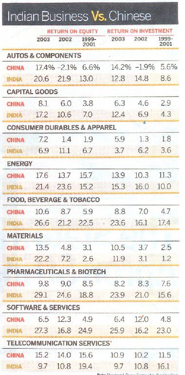
If you look closely this data has numerous relationship between each other…
1) Comparative relationship of each data between India and China
2) Comparative relationship of data of ‘one countries’ between years 2001 to 2003
3) Comparative relationship of data across India-China between years 2001 to 2003
4) Comparative relationship of sectors…
5) Comparative relationship between ROI and ROE
Now my objective of this graphics was to bring out the above comparative data is a way such that it highlights the comparisons and thus to bring clarity.
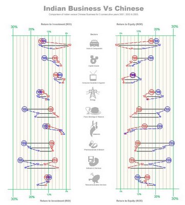
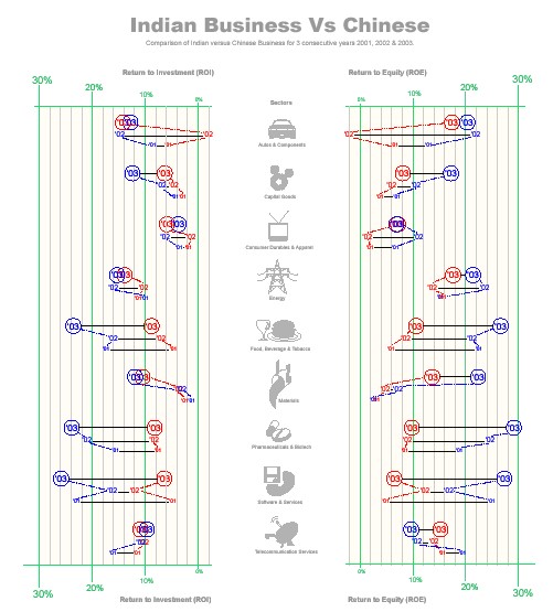
The Design Method
To show various comparisons I used various methods:
- The color code to differentiate between India and China (India in blue and China in Red)
- The change in Typography to differentiate between years…
- A light colored dotted line to guide the ‘eye’ to bring out the comparison in data across year.
- A straight line to help in comparing the data between the two counties in the same year.
- The gird on the back help in finding an approximate values…change in grid line color and width marks the threshold, which help in judging the values.
- Increase in the typography and position of values to ease in perception of the grid thresholds.
- Positioning ROE and ROI across in order to see the relative value. I came to know that the relationship of ROE and ROI may not be very relevant or important.
- Use of graphics (icons) for sectors in order to speed up the perception.
Patterns in ‘Data Visualization’
As apart of our course in ‘Data Visualization’, we were asked to categories different Data visualization techniques. We took a little path to solving this problem…we took the challenge to solve the mystery and create a formula for ourselves…
The process started by collecting about 900 images of various examples of data visualizations. Next came and extensive session of “Brain Storming”…
Brainstorming threw quite interesting view to data visualization…things when categorized gave an interesting picture…
There are various facets to data visualization…
1. Tools
2. Methods
3. Ways of representation
4. Purpose
5. Content
Where Tools were graphical techniques primarily used to distinguish one data from the other…
Methods were various factors like choosing axis, degree of abstraction…etc…its various decision a designer takes before deciding the graphics.
Ways of representation were know “outputs” like pie chart, bar chart, illustration, maps etc…
Purpose is the purpose of making data visualization like instructional, comparison…etc
Content defines the kind of data…like quantitative, descriptive…etc
The next part was little interesting…we realized that Content Purpose and ways of representation were closely connected.
Not only that we sorted the 900 samples into a 2 way matrix to figure out how closely are they connected.
This was an early exploration of the assignment…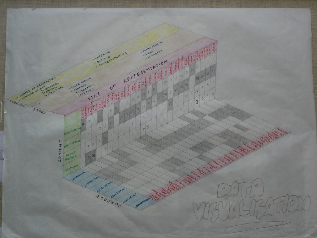
Hitchhikers Guide to the Earth
We generally associate places or cities based on what we hear or experience from them…and we tag them as ‘Historical’, ‘Religious’, ‘Peaceful’, ‘Beaches’, ‘Mystical’ ‘fun’ etc…
So why not have a web-based application running on GIS (like google map) where we allow people to ‘tag’ places with their terms…not only that allow them to “Refer” or post in their experiences related to that place or city. Also if we can store user’s choices we can do a ‘Tag match’ or ‘profile match’ (with other users) and throw in suggestions to the user…like as per your liking these are the places you would like…a travel planner should also be a part of the system. People can suggest places to stay or travel also…which can make the system more comprehensive…
Powered by CBIR (content based image retrieval) we can also “find/search” places based on the uploaded image ‘query by example’…with a descriptive search also I hope we can also sort our and suggest places to visit.
As far as business model is concerned there can be a huge scope for advertisements for travel agencies, hotels etc.
Tuesday, January 24, 2006
Visit my other blog
im no longer posting on this blog...plese do visit my other blogs...especially
http://abikr03.blogspot.com/
where i post my thoughts. As I'm currently working with Yahoo! Software Development, Bangalore. I'm not posting on works and ideas...
Thanks
Saturday, December 24, 2005
Split the blog
one where I' posting my 'Ideas' http://abikr01.blogspot.com/
the other my Academic works done in NID http://abikr02.blogspot.com/
the last one is for thoughts / Articles / Reflections (what ever you want to call it) http://abikr03.blogspot.com/
Please do visit them...
thanks
Wednesday, December 21, 2005
People’s “map” powered by Folksonomy and Web 2.0
I recently went to Bangalore and I boarded an auto rickshaw as asked the driver to take me to ‘IISc’ (Indian Institute of Sciences); to my amazement he didn’t know the place…Strange?? I thought. Later I boarded another auto with the same result. But (with God’s wishes) I got a gentleman who know the place and told the auto driver to take me to “Tata Institute”…ooooh why didn’t you tell me so replied the auto driver…I know that place…
Well I’m sure this was not the first and the last time I have face this problem and I’m sure neither have you…the local and popular NAMES in a city are sometimes quite different from the OFFICIAL one and some times create a communication problem especially to a new tourist/visitor.
That’s the genesis of the idea… “Why not to build a comprehensive People’s Map”
If we can have…Flickr & Delicious why not a Map where people Tag in place with their popular name. The names can be presented as a Tag cloud…or in hierarchy of popularity…may be presented in a drop down on a right click on the official names presented on an online map like Google Map, MSN Map or Yahoo Map…it can be an application that works on top of these applications…or can be integrated with them.
Sunday, November 27, 2005
CTZ : Design Process
Open News portal for Citizen Journalists...
 from my class room project...
Tuesday, November 22, 2005
La planète de mémoires
This is my ‘small effort’ to look at things ‘just a little’ differently. This is part of my academic project…which I want to share with you…
IDEA
The genesis of ‘La planète de mémoires’ came from my previous idea of exploring the possibility of projecting images on trees. The idea was to explore the possibilities of projecting images or video in a VOLUME of space rather than on a flat SCREEN. Initially the plan was to project only one projection on the foliage of a tree, but then came the question that as this is a volume space why not project multiple images and create a moving (real time) 3D collage on a volume of space. But due to some reasons the implementation could not take place. But this idea lied latent before I stuck up with another idea – ‘Why not recreate a 3D surface and in case of projection we can have backlit screen.”
This idea is just an exploration of looking at pictures in a different way - spread into 'space'. With digital cameras, we are all flooded with images. The number of images in our lives is mounting so high that we rarely take out time to see them. It display is a Globe (sphere) with small cubes all aligned together inside them. Each side displays a portion of an image so that the combination makes a substantial part of that image. But to be able to see the image one has to conciously stand in position to make sense of it. Else we only see them in parts- as collage of memories (images) in our life. With a projector on the top it also allows you to project an image on any surface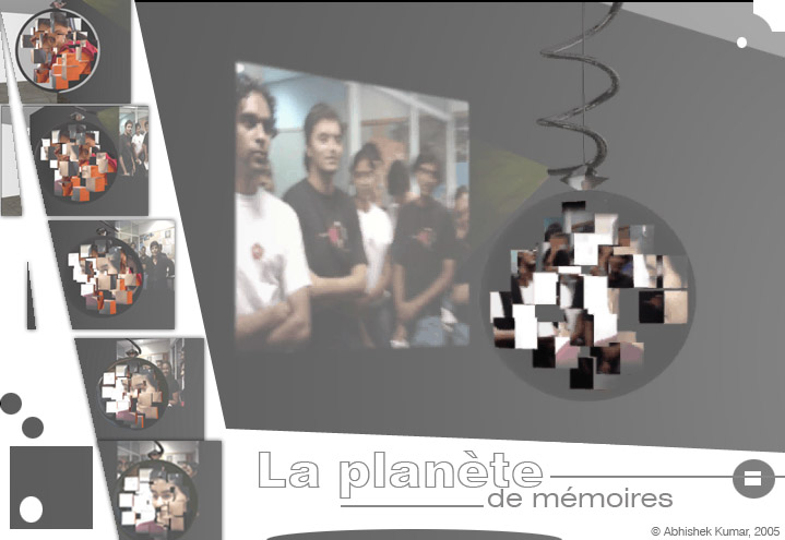 …from my project report
© Abhishek Kumar, 2005
Sunday, November 20, 2005
Asset (RFID) Tags for Intelligent Buildings
The concept of intelligent buildings has been here for quite some time. So I’m not sure where what I’m thinking has been already implemented or not. I was trying to find a project using ‘RFID’ tags, when stumbled upon the idea that “…if I can get a real time data of people inside a building, I can very well build an Intelligent building…”
I searched the MIGHTY ‘internet’ (which is still controlled by the
I came across the web site http://www.aeroscout.com ...its a company which produces Wi-Fi enabled active tags that can be read from a distance of 60 mts inside a building and to about 100 mts outside.
With this kind of technology if I can get a real time data of how many people and where they are inside, then this is what can be done:
Energy Conservation
- Lighting
- Lighting controlled by number of inhabitants and their movement.
- Switch on light where ever needed.
- Control the Lux of light needed based on work and people.
- Switch off lights where not needed.
- Not only lights but other equipments can also be switched off/on based on the need.
- Air conditioning/Heating
- Switch off or on system depending on people.
- A personal cabin can be automatically controlled by his/her preference.
- The blowers and vents can be controlled depending on where the people are.
- Auto start by entry into a building. When an employee parks his/her car his/her cabin’s A/C can start so that by the time he/she comes in its cool enough with his/her preference.
- Backup
- Backup system for electricity can be provided to specific area , again based on the requirement and number of people.
Security
- Building access
- Building access can be provided by authenticating by RFID tag.
- Public Address System
- In case of emergency/fire portions which have inhabitants can be specifically/effectively addressed.
- Fire fighting / Rescue
- During rescue operation RFID tags can track the number of people traped up in the building.
- Monitor Assets
- Assets like machines or equipments can be tagged and monitored.
- Track personal cars in building parking lots.
- Even track individuals in huge building premises (though privacy issues are there but there could be a design solution to tackle the problem)
- Even the tag can be used as a digital key to secure computers, almirahs, shelves, storages, intra-payments etc.
The RFID tag ‘holder’ itself can be designed to perform multiple tasks like it can work like a ‘pen drive’.
But no doubt there will be privacy issues…but I hope we can find a solution to that...
You can ignore...because its just 'an idea'...
cheers :)
Friday, November 18, 2005
the User Experience...(part II)
I blog just to share my ideas…that to in a very generic way...
But I thought I should write more into details about my previous post…as one anonymous reader has pointed out…
I guess the idea quoted in the previous posting is not unique…it’s just that I realize a system exists…it will be a huge topic to debate and research…but if I have understood correctly Jesse James Garrett “Elements of User Experience” also in a way states these factors…though he believes its in layers while I believe they are equal and effect each other more strongly…
But someone in the field of UI may (I hope) accept my argument that these are related and I explain this with an example…
Let’s look at various perspectives…
Suppose we start with finding the commands required…and arrange in a logical sequence (information Design)…how many commands are required…which ones are more important >> how many commands we need to add will define the interaction…can all commands be presented to user… >> UI elements are decided by what function each command performs…where it is placed…either all buttons or drop down or mixed >> also the visuals…whether all are in one row or in multiple rows…what icons are required…how many and how to make them different from already existing ones but yet should look like a part of the family…does it starts to dominate the other commands >> Usability consideration would be…are all the icons understood by user…is the terminology of the command correct…are the buttons spaces correct…is the interaction or UI elements fit into the metaphor of existing tools/commands…
So the ‘Experience’ of using that tool bar would come as combined effort of all these factors and not one…if the icon is not properly understood then…even if it is beautifully designed will spoil the experience…or if it is usable but doesn’t look good then also the Experience will suffer…again if the information architecture is not perfect usability will suffer and even a good icon wouldn’t bring the experience…
If we find that there is not enough space for 8 commands, only 5 can be presented…then we have to either think of new interaction model or UI elements or change the information architecture…may be break the tool bar into 2…if they change the visual design would also change and hence the Usability experts again have to evaluate the new design…
This is huge topic to write…but I strongly believe a good design is one which takes care of if not all then MOST parameters…and that’s the key to USER EXPERIENCE…
I would appreciate if readers could mention their names while posting comments…
Thanks & cheers…
© Abhishek Kumar, 2005
Thursday, November 17, 2005
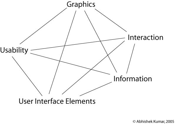
the User Experience...
Why do we enjoy a good ‘food’??? becoz it has a perfect blend of spices and ingredients. A good cook will tell you that it’s all out ‘just perfect’ mix of ingredients…so its all about knowing and realizing this perfect mix of things for GOOD USER EXPERIENCE in products…
The ingredients involve…
- Usability
- Graphic
- Interaction
- Information
- UI Elements
So as a cook (designer) your main aim is to mix them together to make a good dish (product) out of them…skipping one or not mixing one in proper proportions would spoil the taste (experience).

So a good UI would have a good composition…where neither of the above factors dominate but work in harmony with each other…
The graphics should not dominate the information, the UI elements should compliment interaction, the graphic changes with change in UI elements or Interaction, and usability results can changes with change in any of the parameters…so it’s all connected and it’s all a SYSTEM…
Confused state of mind
Aaaah, free time again…and time to post some ideas…
I just gave an interview and to my horror I was asked…’what I want to be??’....the most difficult question to answer…what can I be??
- A Usability Expert
- An Information Architect
- A User Interface Designer
- A Graphic Designer
- An Interaction Designer
- A User Experience Designer
It’s such a tricky question…either I don’t know the exact meaning or the whole world is confused about it…becoz I never got a clear definition of any of them…
So I though of defining it for myself…
Usability: I believe it’s a field which tries to identify problems in using a product. Also it covers the testing and user research areas.
Information Architecture: Information Architecture is a sub set of Information Design…and what it does is that it tries to simplify and present the information (or commands) in a more understandable and easily perceivable way to the user.
User Interface Designer: UI design basically concentrates on UI elements, their placement on the screen and the composition of the screen.
Graphic Designer: Graphic designer is concerned for the look and feel of the UI. The color schemes ad the icons.
Interaction Designer: Interaction Designer basically handles the interaction of the product. To be an interaction designer one need to have some basic understanding of Graphics, Usability and Information design.
User Experience Designer: User experience designer should come on top of every one. When we talk to ‘experience’, then we should understand that EXPERIENCE come when you have a perfect blend of all elements Graphics, Usability and Information Design. To generate an experience the product should be usable, should be good looking, should have interesting interactions to generate the WOOW effect and should be good in information design (again to make the product easy to use and to find information).
Any one reading this post is welcome to post comments…
I am waiting for some one who can clarify my doubts about these TERMS….